# Getting Started with the AppBar
This tutorial explains how to set up a basic Telerik UI for ASP.NET MVC AppBar and highlights the major steps in the configuration of the component.
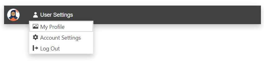
You will initialize an AppBar component with two content items—an [Avatar](https://www.telerik.com/aspnet-mvc/documentation/html-helpers/layout/avatar/overview) and a [DropDownButton](https://www.telerik.com/aspnet-mvc/documentation/html-helpers/navigation/dropdownbutton/overview) components.
## Prerequisites
To successfully complete the tutorial, you need a project that is already configured to use the Telerik UI for ASP.NET MVC components:
* To create a new pre-configured project for the Telerik UI for ASP.NET MVC components, you can [use a project template](https://www.telerik.com/aspnet-mvc/documentation/getting-started-mvc/first-steps).
* To manually configure an existing project by using NuGet, see the [Adding Telerik UI through NuGet](https://www.telerik.com/aspnet-mvc/documentation/getting-started/setup-with-nuget).
## 1. Prepare the CSHTML File
The first step is to add the required directives at the top of the `.cshtml` document:
* To use the Telerik UI for ASP.NET MVC HtmlHelpers:
```cshtml
@using Kendo.Mvc.UI
```
Optionally, you can structure the View content by adding the desired HTML elements like headings, divs, paragraphs, and others.
```Razor HtmlHelper
@using Kendo.Mvc.UI
```
## 2. Initialize the AppBar
Use the AppBar HtmlHelper to add the component to a page:
* The `Name()` configuration method is mandatory as its value is used for the `id` and the `name` attributes of the AppBar element.
* The `Position()` option defines the AppBar position on the page.
* The `PositionMode()` option sets the position type—`Static`, `Sticky`, or `Fixed`.
* The `Items()` method defines the component items.
```Razor HtmlHelper
@using Kendo.Mvc.UI
@(Html.Kendo().AppBar()
.Name("appbar")
.Position(AppBarPosition.Top)
.PositionMode(AppBarPositionMode.Sticky)
.Items(items=> {
items.Add().Template("Item 1")Type(AppBarItemType.ContentItem);
items.Add().Type(AppBarItemType.Spacer).Width("8px");
items.Add().Template("Item 2").Type(AppBarItemType.ContentItem);
})
)
```
## 3. Configure the Avatar and DropDownButton Items
The next step is to integrate the Avatar and DropDownButton components by using the [`Template`](https://www.telerik.com/aspnet-mvc/documentation/html-helpers/template/overview) component.
```Razor HtmlHelper
@using Kendo.Mvc.UI
@(Html.Kendo().AppBar()
.Name("appbar")
.Position(AppBarPosition.Top)
.PositionMode(AppBarPositionMode.Sticky)
.ThemeColor(AppBarThemeColor.Inverse)
.Items(items=> {
items.Add().Template(Html.Kendo().Template().AddComponent(avatar => avatar
.Avatar()
.Name("avatar")
.Type(AvatarType.Image)
.Size(ComponentSize.Medium)
.Rounded(Rounded.Full)
.Image(@Url.Content("~/shared/web/Kendoka-32.png"))
)).Type(AppBarItemType.ContentItem);
items.Add().Type(AppBarItemType.Spacer).Width("8px");
items.Add().Template(Html.Kendo().Template().AddComponent(ddlbtn => ddlbtn
.DropDownButton()
.Name("userSettings")
.Text("User Settings")
.Icon("user")
.FillMode(FillMode.Flat)
.Rounded(Rounded.Full)
.Items(items=>{
items.Add().Id("profile").Text("My Profile").Icon("image");
items.Add().Id("settings").Text("Account Settings").Icon("gear");
items.Add().Id("logout").Text("Log Out").Icon("logout");
})
)).Type(AppBarItemType.ContentItem);
})
)
```
## 4. Handle the AppBar Events
The AppBar exposes the [`Resize`](https://www.telerik.com/aspnet-mvc/documentation/api/kendo.mvc.ui.fluent/appbareventbuilder) event that you can handle and further customize the functionality of the component during its resizing. In this tutorial, you will use the `Resize` event to capture when the AppBar is resized and the viewport is less or equal to 400 pixels wide.
```Razor HtmlHelper
@using Kendo.Mvc.UI
@(Html.Kendo().AppBar()
.Name("appbar")
.Position(AppBarPosition.Top)
.PositionMode(AppBarPositionMode.Sticky)
.ThemeColor(AppBarThemeColor.Inverse)
.Events(ev => ev.Resize("oResize"))
.Items(items=> {
items.Add().Template(Html.Kendo().Template().AddComponent(avatar => avatar
.Avatar()
.Name("avatar")
.Type(AvatarType.Image)
.Size(ComponentSize.Medium)
.Rounded(Rounded.Full)
.Image(@Url.Content("~/shared/web/Kendoka-32.png"))
)).Type(AppBarItemType.ContentItem);
items.Add().Type(AppBarItemType.Spacer).Width("8px");
items.Add().Template(Html.Kendo().Template().AddComponent(ddlbtn => ddlbtn
.DropDownButton()
.Name("userSettings")
.Text("User Settings")
.Icon("user")
.FillMode(FillMode.Flat)
.Rounded(Rounded.Full)
.Items(items=>{
items.Add().Id("profile").Text("My Profile").Icon("image");
items.Add().Id("settings").Text("Account Settings").Icon("gear");
items.Add().Id("logout").Text("Log Out").Icon("logout");
})
)).Type(AppBarItemType.ContentItem);
})
)
```
```JS scripts
```
## 5. (Optional) Reference Existing AppBar Instances
You can reference the AppBar instances that you have created and build on top of their existing configuration.
Use the `id` attribute of the component instance to get its reference.
```JS script
```
For more information on referencing specific helper instances, see the [Methods and Events](https://www.telerik.com/aspnet-mvc/documentation/html-helpers/helper-basics/events-and-methods) article.
## Next Steps
* [Setting the AppBar Items](https://www.telerik.com/aspnet-mvc/documentation/html-helpers/navigation/appbar/items)
* [Positioning the AppBar](https://www.telerik.com/aspnet-mvc/documentation/html-helpers/navigation/appbar/position)
## See Also
* [Client-Side API of the AppBar](https://docs.telerik.com/kendo-ui/api/ui/appbar)
* [Server-Side API of the AppBar HtmlHelper](https://www.telerik.com/aspnet-mvc/documentation/api/appbar)
* [Knowledge Base Section](https://www.telerik.com/aspnet-mvc/documentation/knowledge-base)