# Getting Started with the Circular ProgressBar
This tutorial explains how to set up a basic Telerik UI for ASP.NET MVC Circular ProgressBar and highlights the major steps in the configuration of the component.
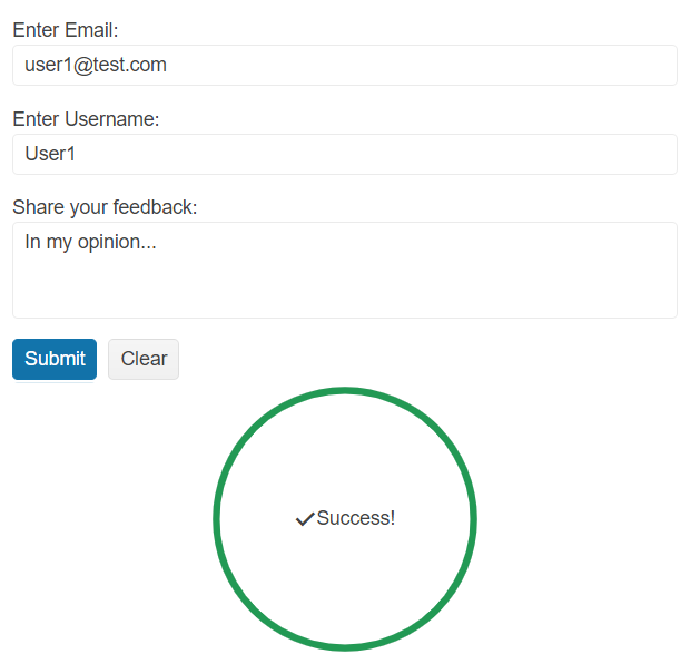
You will initialize a hidden Circular ProgressBar that will be displayed when a [Form](https://www.telerik.com/aspnet-mvc/documentation/html-helpers/layout/form/overview) is completed and validated successfully. Next, you will learn how to reference the client-side instance of the component and control its behavior by using the available API methods.
## Prerequisites
To successfully complete the tutorial, you need a project that is already configured to use the Telerik UI for ASP.NET MVC components:
* To create a new pre-configured project for the Telerik UI for ASP.NET MVC components, you can [use a project template](https://www.telerik.com/aspnet-mvc/documentation/getting-started-mvc/first-steps).
* To manually configure an existing project by using NuGet, see the [Adding Telerik UI through NuGet](https://www.telerik.com/aspnet-mvc/documentation/getting-started/setup-with-nuget).
## 1. Prepare the CSHTML File
The first step is to add the required directives at the top of the `.cshtml` document:
* To use the Telerik UI for ASP.NET MVC HtmlHelpers:
```cshtml
@using Kendo.Mvc.UI
```
Optionally, you can structure the View content by adding the desired HTML elements like headings, divs, paragraphs, and others.
```Razor HtmlHelper
@using Kendo.Mvc.UI
Submit your feedback
```
## 2. Initialize the Circular ProgressBar
Use the Circular ProgressBar HtmlHelper to add the component to a page:
* The `Name()` configuration method is mandatory as its value is used for the `id` and the `name` attributes of the Circular ProgressBar element.
* The `Value()` option specifies the initial component value (a number between 0 and 100).
Set `display: none;` to the `div` container that wraps the component to ensure that it is hidden when the page loads.
```Razor HtmlHelper
@using Kendo.Mvc.UI
@(Html.Kendo().CircularProgressBar()
.Name("form-progressbar")
.Value(0)
)
```
## 3. Configure the Form Component
The next step is to create a basic [Form](https://www.telerik.com/aspnet-mvc/documentation/html-helpers/layout/form/overview) component with three required fields and handle the `Submit` and `ValidateField` Form events. For more information on how to subscribe to these events, [refer to the Form Events article](https://www.telerik.com/aspnet-mvc/documentation/html-helpers/layout/form/events).
```Razor HtmlHelper
@using Kendo.Mvc.UI
@(Html.Kendo().Form()
.Name("formExample")
.Events(ev => ev.Submit("onSubmit").ValidateField("onValidateField"))
.HtmlAttributes(new { action = "Index", method = "POST" })
.Items(i =>
{
i.Add()
.Field(f => f.Email)
.InputHtmlAttributes(new { @type="email", @required="required" })
.Label(l => l.Text("Enter Email:"));
i.Add()
.Field(f => f.UserName)
.InputHtmlAttributes(new {@required="required" })
.Label(l => l.Text("Enter Username:"));
i.Add()
.Field(f => f.Feedback)
.InputHtmlAttributes(new { @required="required" })
.Label(l => l.Text("Share your feedback:"))
.Editor(e => e.TextArea().Rows(3));
})
)
```
```JS script
```
## 4. Display the Circular ProgressBar
Now, you can implement the client-side logic that will validate the Form and display the Circular ProgressBar if all fields are completed successfully.
* Prevent the default action of the Form [`Submit`](https://docs.telerik.com/aspnet-core/api/kendo.mvc.ui.fluent/formeventbuilder#submitsystemstring) event and call the [`validate()`](https://docs.telerik.com/kendo-ui/api/ui/form/methods/validate) method to validate the fields when the Form is submitted. If method returns `true` (the Form is valid), add the following logic:
1. Use the jQuery [`show()`](http://api.jquery.com/show/) method to show the hidden container that holds the Circular ProgressBar.
2. Get a reference to the Circular ProgressBar and trigger its [`redraw()`](https://docs.telerik.com/kendo-ui/api/ui/circularprogressbar/methods/redraw) method to redraw it when it is displayed.
3. Set the Circular ProgressBar value to `100` through its [`value()`](https://docs.telerik.com/kendo-ui/api/ui/circularprogressbar/methods/value) method. As a result, the component will indicate the task completion.
Also, you can set the [`opacity`](https://developer.mozilla.org/en-US/docs/Web/CSS/opacity) CSS property to the Form container during the progress loading for a better look and feel.
```JS scripts
```
* In the Form [`ValidateField`](https://docs.telerik.com/aspnet-core/api/kendo.mvc.ui.fluent/formeventbuilder#validatefieldsystemstring) event handler, check the validation state of the field and use the jQuery [`hide()`](http://api.jquery.com/hide/) method to hide the `div` container that holds the Circular ProgressBar if it is `false`. This way, the Circular ProgressBar will be hidden when any Form field is invalid.
```JS scripts
```
* Handle the `click` event of the Form `Clear` button and hide the Circular ProgressBar container when the values of the Form fields are cleared.
```JS scripts
```
## 5. Customize the Appearance of the Circular ProgressBar
To enhance the appearance of the Circular ProgressBar, use the `CenterTemplate()` option, to specify the desired content that will be displayed in the center of the progress bar.
```Razor HtmlHelper
@using Kendo.Mvc.UI
@(Html.Kendo().CircularProgressBar()
.Name("form-progressbar")
.Value(0)
.CenterTemplate("Success!")
)
```
In additon, you can adjust the default Circular ProgressBar color through the `Colors` configuration.
```Razor HtmlHelper
@using Kendo.Mvc.UI
@(Html.Kendo().CircularProgressBar()
.Name("form-progressbar")
.Value(0)
.CenterTemplate("Success!")
.Colors(c =>
{
c.Add().Color("#229954").From(0).To(100);
})
)
```
## 6. (Optional) Reference Existing Circular ProgressBar Instances
You can reference the Circular ProgressBar instance that you have created, [as demonstrated in Step 4](https://www.telerik.com/aspnet-mvc/documentation/html-helpers/interactivity/circularprogressbar/getting-started#4-display-the-circular-progressbar), and build on top of its existing configuration:
1. Use the `Name()` option of the component to establish a reference.
```JS script
```
2. Use the [Circular ProgressBar client-side API](https://docs.telerik.com/kendo-ui/api/ui/circularprogressbar#methods) to control the behavior of the widget. In this example, you will use the `setOptions()` method to change the current color of the Circular ProgressBar dynamically (for example, when a button is clicked), and the `redraw()` method to redraw the component with the updated color.
```Razor HtmlHelper
@(Html.Kendo().Button()
.Name("btn")
.Content("Update Circular ProgressBar color")
.Events(ev => ev.Click("onBtnClick")))
```
```JS scripts
```
For more information on referencing specific helper instances, see the [Methods and Events](https://www.telerik.com/aspnet-mvc/documentation/html-helpers/helper-basics/events-and-methods) article.
## Next Steps
* [Using the Indeterminate mode of the Circular ProgressBar for ASP.NET MVC (Demo)](https://demos.telerik.com/aspnet-mvc/circularprogressbar/indeterminate)
## See Also
* [Using the API of the Circular ProgressBar for ASP.NET MVC (Demo)](https://demos.telerik.com/aspnet-mvc/circularprogressbar/api)
* [Client-Side API of the Circular ProgressBar](https://docs.telerik.com/kendo-ui/api/ui/circularprogressbar)
* [Server-Side API of the Circular ProgressBar](https://www.telerik.com/aspnet-mvc/documentation/api/circularprogressbar)
* [Knowledge Base Section](https://www.telerik.com/aspnet-mvc/documentation/knowledge-base)