# Overview
> * R1 2023 is the last official release of Telerik UI for ASP.NET Core, where LESS Themes are supported and shipped with the product. See the [Less to Sass Theme Migration Article](https://www.telerik.com/aspnet-core-ui/documentation/styles-and-layout/less-themes/less-themes-migration) for more information on how to migrate to SASS.
The appearance of the Telerik UI for ASP.NET Core components is achieved by rendering predefined classes in the various Html elements of the components. The themes use these classes, to apply styles to the respective elements.
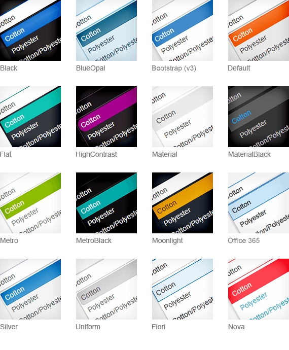
## Adding a Theme to Your Project
To add a LESS theme to your project, reference a common (base) stylesheet and a theme stylesheet.
* `kendo.common.css`—This is a common (base) stylesheet. It applies styles related to element positioning and component dimensions.
* `kendo.[theme].css`—This stylesheet applies theme-specific styles such as: color palette, background gradients, patterns, etc.
The following example demonstrates how to reference the required stylesheets of the `Default` LESS theme in your project, when using local files:
```html
```
> * You must add the common CSS file before the theme CSS file.
> * Only one pair of common and theme CSS files should be referenced.
The following example demonstrates how to reference the required stylesheets of the `Default` LESS theme in your project from the Kendo UI npm package by using jsDelivr:
```html
```
## Common CSS Files
Some of the LESS themes require the `kendo.common.css` common (base) stylesheet, others require a different common stylesheet. The following table shows the various themes dependencies on the common files:
| CSS Files | Contents and Application |
| :--------------------------- | :------------------------------------------------------------------------------------------------------------------------------------------------------------------------------------------- |
| `kendo.common.css` | The default base stylesheet. Required by the majority of the LESS themes. |
| `kendo.common-bootstrap.css` | The base stylesheet for the Bootstrap (v3) theme. Use this file instead of `kendo.common.css` and only with `kendo.bootstrap.css` theme file to achieve Bootstrap-like component dimensions. |
| `kendo.common-material.css` | The base stylesheet for the Material and MaterialBlack themes. Use this file instead of `kendo.common.css` and only with `kendo.material.css` or `kendo.materialblack.css` theme files. |
| `kendo.common-nova.css` | The base stylesheet for the Nova theme. Use this file instead of `kendo.common.css` and only with `kendo.nova.css`. |
| `kendo.common-fiori.css` | The base stylesheet for the Fiori theme. Use this file instead of `kendo.common.css` and only with `kendo.fiori.css`. |
| `kendo.common-office365.css` | The base stylesheet for the Office365 theme. Use this file instead of `kendo.common.css` and only with `kendo.office365.css`. |
## Theme-Related Folders
Apart from the common stylesheet and theme stylesheet, you must make the following folders available in your application.
* `/ThemeName/`—This is the folder, which contains all images required by the LESS themes. The folder name matches the theme name, e.g. `Default`, `Bootstrap`, `Silver`, etc. The theme image folders for unused themes can be removed.
* `/fonts/`—This is where the `KendoUIGlyphs` and `DejaVu` font files reside. The `KendoUIGlyphs` font describes the Kendo UI font icons used by the components.
* `/images/`—This where the Kendo UI font icons for the components reside.
* `/textures/`—This is where some fallback theme images are stored for browsers that do not support the CSS3 linear gradients.
## Primitives
The Telerik UI for ASP.NET Core components use primitives, meaning that different HTML elements in different components use the same CSS classes to provide a level of abstraction and allow common styling. To learn how to modify the primitives, check the [Overriding Primitives](https://www.telerik.com/aspnet-core-ui/documentation/styles-and-layout/less-themes/customization#overriding-primitives) documentation section.
### Common CSS Classes
| CSS Class | Behavior |
| :------------------------ | :------------------------------------------------------------------------------------------------------------------------------------------------------------------------------------------------------------------------------------------------------------ |
| `k-widget` | The class is applied to the component wrapper to set a border, text and background color. In addition to `k-widget`, every component has its own specific CSS class, such as `k-menu`, `k-panelbar`, `k-tabstrip`, etc. |
| `k-header` | Applied to Grid headers, Menu top level items, PanelBar top level items, TabStrip items, and DropDownLists to set a background image and a background color. |
| `k-link` | Applied to hyperlinks and clickable text items to set a text color. |
| `k-button` | Applied to elements that are expected to look like push buttons. The class sets a text color, background color, background image, and hover styling. This is the recommended class for styling form buttons. |
| `k-input` | Applied to textboxes inside input components like ComboBox and AutoComplete to set border, text and background color. |
| `k-textbox` | Same as `k-input`, but used for standalone (generic) `input` elements that are not part of a component. This is the recommended class for styling form `input` elements as it provides the same look, height, and vertical alignment as the input components. |
| `k-checkbox` | Applied to checkboxes inside the TreeView component, when checkboxes are enabled for it. |
| `k-group` and `k-content` | Applied to various containers to set a background and border color. |
| `k-popup` | Applied to popup containers that are detached from their opener component and are placed in the `body` element. |
| `k-icon` and `k-sprite` | Applied to elements that display part of a sprite image as background to initialize their dimensions. |
| `k-image` | Applied to inline images to set their dimensions. |
| `k-item` | Applied to various repeating component items, for example, Menu, TabStrip, TreeView, PanelBar, ComboBox, DropDownList, etc. This CSS class does not apply any particular global styles and sports `display: block`. |
| `k-first` and `k-last` | Set on the first and the last `k-item` respectively, where a special type of styling is needed, for example, rounded corners and removing borders. |
### The k-state Classes
The appearance of a component may well depend on its state, which is also tied to CSS classes.
| Class | Behavior |
| :----------- | :------------------------------------------------------------------------------------ |
| `k-hover` | Set to items when they are hovered to apply their hovered look. |
| `k-focused` | Applied on focused, mostly `input` elements and the DropDownList. |
| `k-active` | Set on activated `k-link` elements. |
| `k-selected` | Set to selected items to apply their selected look like in the PanelBar and TabStrip. |
| `k-disabled` | Applied to disabled items. |
## Backwards Compatibility
This section includes issues related to the backwards compatibility.
The LESS themes support only the default values of the new [Components Styling Options](https://www.telerik.com/aspnet-core-ui/documentation/styles-and-layout/components-rendering-overview#styling-options). If you want to use the full potential of the styling options, consider [migrating to the SASS themes](https://www.telerik.com/aspnet-core-ui/documentation/styles-and-layout/less-themes/less-themes-migration).
### Rounded Components with the High Contrast Theme
As of 2022 R1, the default value for the [Rounded styling option](https://www.telerik.com/aspnet-core-ui/documentation/styles-and-layout/components-rendering-overview#rounded) of the components is `Medium`. It is applyed through the `k-rounded-md` class.
To revert back to the previous border-radius (9999px) value, set the `Rounded` option of the component to `Full`.
## See Also
* [Sass Themes Overview](https://www.telerik.com/aspnet-core-ui/documentation/styles-and-layout/sass-themes/overview)
* [SVG Icons](https://www.telerik.com/aspnet-core-ui/documentation/styles-and-layout/sass-themes/svg-icons)
* [Web Font Icons](https://www.telerik.com/aspnet-core-ui/documentation/styles-and-layout/sass-themes/font-icons)