# Getting Started with the DateRangePicker
This tutorial explains how to set up a basic Telerik UI for ASP.NET Core DateRangePicker and highlights the major steps in the configuration of the component.
You will initialize a DateRangePicker control with a number of tools. Next, you will handle some of the DateRangePicker events. Finally, you can run the sample code in [Telerik REPL](https://netcorerepl.telerik.com/) and continue exploring the components.
## Prerequisites
To successfully complete the tutorial, you need a project that is already configured to use the Telerik UI for ASP.NET Core components:
* You can use the [Telerik REPL](https://netcorerepl.telerik.com/) playground and skip installing the components on your system and configuring a project.
* You can prepare a Visual Studio project by following the following guide:
* Creating a new pre-configured project for the Telerik UI for ASP.NET Core components from [a project template](https://www.telerik.com/aspnet-core-ui/documentation/vs-integration/new-project-wizard).
## 1. Prepare the CSHTML File
The first step is to add the required directives at the top of the `.cshtml` document:
* To use the Telerik UI for ASP.NET Core HtmlHelpers:
```cshtml
@using Kendo.Mvc.UI
```
* To use the Telerik UI for ASP.NET Core TagHelpers:
```cshtml
@addTagHelper *, Kendo.Mvc
```
Optionally, you can structure the document by adding the desired HTML elements like headings, divs, paragraphs, and apply some basic styles.
## 2. Initialize the DateRangePicker
Use the DateRangePicker HtmlHelper or TagHelper to add the component to a page:
* The `Name()` configuration method is mandatory as its value is used for the `id` and the `name` attributes of the DateRangePicker element.
* The `Culture()` configuration method specifies the culture info used by the widget. `Date` and `time` values typically vary by culture. For example, the `"d"` standard format string indicates that a date and time value is to be displayed using a short date pattern. For the invariant culture, this pattern is `"MM/dd/yyyy"`. For the `fr-FR` culture, it is `"dd/MM/yyyy"`. For the `ja-JP` culture, it is `"yyyy/MM/dd"`.
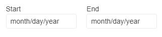
* The `Labels` configuration method determines if the labels for the inputs will be visible.
```Razor HtmlHelper
@using Kendo.Mvc.UI
@(Html.Kendo().DateRangePicker()
.Name("daterangepicker")
.Culture("fr-FR")
.Labels(true)
)
```
```Razor TagHelper
@addTagHelper *, Kendo.Mvc
```
## 3. Handle the DateRangePicker Events
The DateRangePicker [exposes various events](https://www.telerik.com/aspnet-core-ui/documentation/api/kendo.mvc.ui.fluent/daterangepickereventbuilder) that you can handle and further customize the functionality of the component. In this tutorial, you will use the `Open`, `Close`, and `Change` events of the DateRangePicker.
```Razor HtmlHelper
@using Kendo.Mvc.UI
@(Html.Kendo().DateRangePicker()
.Name("daterangepicker")
.Culture("fr-FR")
.Labels(true)
.Events(e=> e.Open("onOpen").Close("onClose").Change("onChange"))
)
```
```Razor TagHelper
@addTagHelper *, Kendo.Mvc
```
For more examples, refer to the [demo on using the events of the DateRangePicker](https://demos.telerik.com/aspnet-core/daterangepicker/events).
## 4. (Optional) Reference Existing DateRangePicker Instances
To use the [client-side API of the DateRangePicker](https://docs.telerik.com/kendo-ui/api/ui/daterangepicker) and build on top of its initial configuration, you need a reference to the DateRangePicker instance. Once you get a valid reference, you can call the respective API methods:
1. Use the `.Name()` (`id` attribute) of the component instance to get a reference.
```JS script
```
2. Use the [client-side API of the DateRangePicker](https://docs.telerik.com/kendo-ui/api/ui/daterangepicker) to control the behavior of the widget. In this example, you will use the [`enable`](https://docs.telerik.com/kendo-ui/api/ui/daterangepicker/methods/enable) method to disable the DateRangePicker.
```JS script
```
For more information on referencing specific helper instances, see the [Methods and Events](https://www.telerik.com/aspnet-core-ui/documentation/html-helpers/helper-basics/events-and-methods) article.
## Explore this Tutorial in REPL
You can continue experimenting with the code sample above by running it in the Telerik REPL server playground:
* [Sample code with the DateRangePicker HtmlHelper](https://netcorerepl.telerik.com/QnYScCbF53Nh3A5V48)
* [Sample code with the DateRangePicker TagHelper](https://netcorerepl.telerik.com/mdOTaGvI52raPXWh54)
## Next Steps
* [Configuring the Selected Dates of the DateRangePicker ](https://www.telerik.com/aspnet-core-ui/documentation/html-helpers/editors/daterangepicker/selected-dates)
* [Changing the Appearance of the DateRangePicker](https://www.telerik.com/aspnet-core-ui/documentation/html-helpers/editors/daterangepicker/appearance)
* [Using Validation with the DateRangePicker](https://www.telerik.com/aspnet-core-ui/documentation/html-helpers/editors/daterangepicker/validation)
## See Also
* [Using the API of the DateRangePicker for ASP.NET Core (Demo)](https://demos.telerik.com/aspnet-core/daterangepicker/api)
* [Client-Side API of the DateRangePicker](https://docs.telerik.com/kendo-ui/api/ui/daterangepicker)
* [Server-Side API of the DateRangePicker](https://www.telerik.com/aspnet-core-ui/documentation/api/daterangepicker)
* [Knowledge Base Section](https://www.telerik.com/aspnet-core-ui/documentation/knowledge-base)