
Why Move to Input Signals—Bye, @Input() 👋
 by Dany Paredes

Summarize with AI:
You know about the Input decorator in Angular. Did you know that Angular 17 brought us signal inputs? Signals allow primitive types to react to changes, and now we can do that via input! This will mean cleaner code that’s easier to maintain!
In Angular, over the past years, one way to communicate between components has been using the @Input() decorator. It helps us pass information between components—however, when we use the @Input() decorator, it is most often combined with ngOnChanges and the SimpleChanges type to react to changes in the application.
The introduction of Signals marks a significant change in how reactivity works in Angular. Signals allow primitive types to react to changes, making interactions easier and, most importantly, reducing the amount of code written.
Today, I have great news for you. In Angular 17.1, we have signal() inputs! This enables the full power of signals in our inputs. We will cover most of the options and compare the original @Input() with the new signals input, learning by doing how signal inputs can reduce boilerplate, lifecycle hooks and more.
As always, the best way to learn is through a real-world scenario! Let’s do it!
Scenario
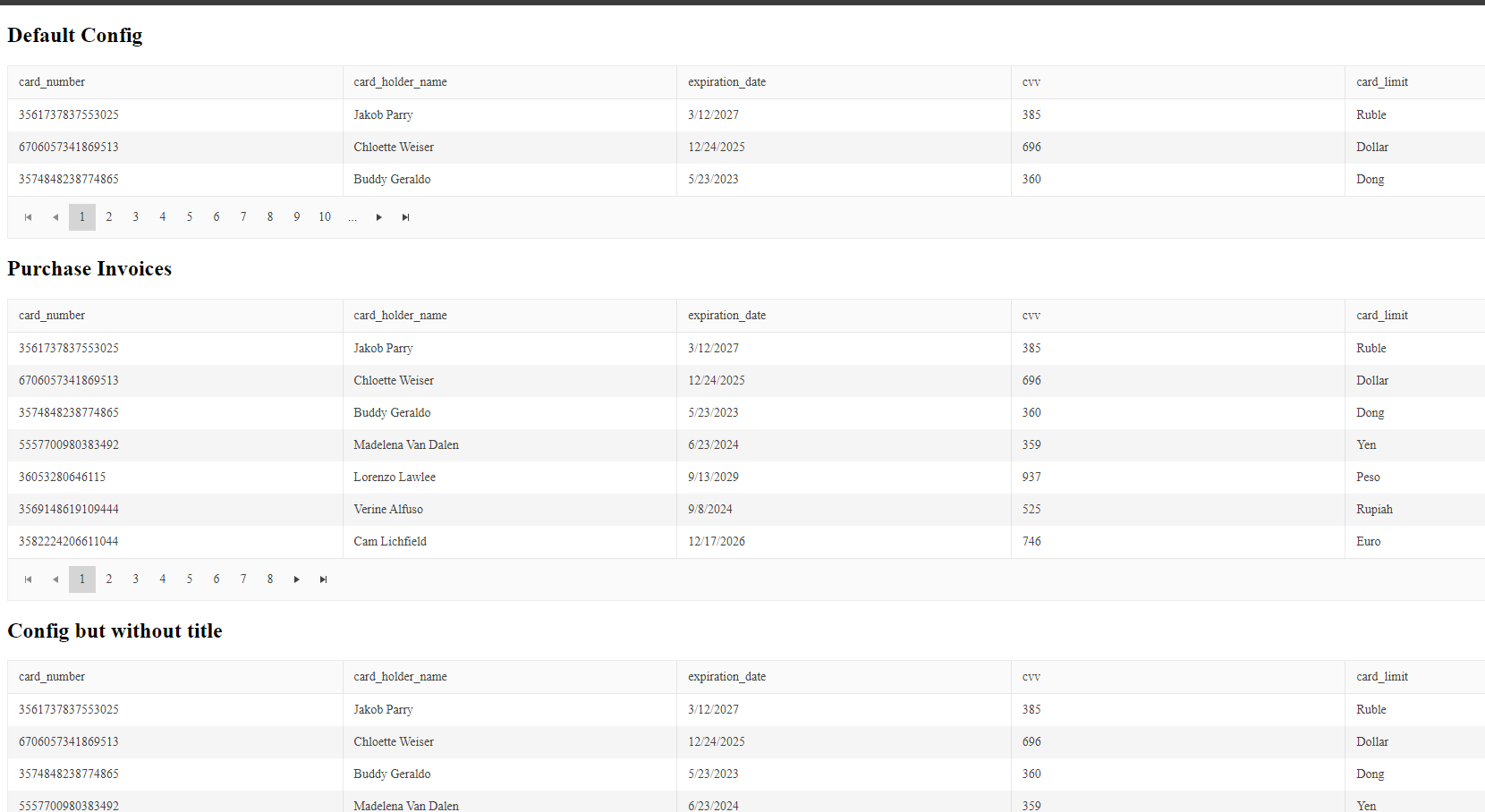
We want to have a component that shows a grid set to certain data parameters. Its title should reflect that configuration. This is where we’re headed:
To simplify the binding of kendo-grid properties, we can create a new GridConfig object. The component will provide two input properties, data and config, and at the same time cover the following cases.
- Pass a configuration object with three properties:
title,enabledPagination,itemsPerPage. - The title is optional.
- The configuration is not required.
- If the configuration is not set, set a default.
- The data must be required.
- Show a title when the configuration is empty or missing.
It’s a step-by-step process, but the main goal is to see the differences between @Input and the new signal inputs. So, let’s code!
Set Up the Project
First, set up your Angular application with the command ng new using-signal-inputs.
ng new using-signal-inputs
cd using-signal-inputs
npm install
Next install the Kendo UI for Angular Grid, by using a schematics command to register:
ng add  @progress/kendo-angular-grid
UPDATE src/app/app.module.ts (515 bytes)
UPDATE package.json (1708 bytes)
UPDATE angular.json (3165 bytes)
√ Packages installed successfully.
UPDATE src/main.ts (259 bytes)
UPDATE tsconfig.app.json (294 bytes)
UPDATE tsconfig.spec.json (300 bytes)
We’re all set up, so let’s proceed with our wrapper component.
The Wrapper Component
First, we generate the component using the Angular CLI command ng generate component /components/invoices:
ng g c /components/invoices
CREATE src/app/components/invoices/invoices.component.html (24 bytes)
CREATE src/app/components/invoices/invoices.component.spec.ts (633 bytes)
CREATE src/app/components/invoices/invoices.component.ts (255 bytes)
CREATE src/app/components/invoices/invoices.component.scss (0 bytes)
Open the invoice.component.ts file and import the GridModule in the imports section:
import {Component } from '@angular/core';
import {GridModule} from "@progress/kendo-angular-grid";

@Component({
  selector: 'app-invoices',
  standalone: true,
  imports: [
    GridModule
  ],
  templateUrl: './invoices.component.html',
  styleUrl: './invoices.component.scss'
})
export class InvoicesComponent {

}
Define GridConfig and defaultConfig
We have the following two requirements to complete:
- Pass a configuration object with three properties:
title,enablePaginationanditemsPerPage. - Make the title optional.
To make it simple, on top of invoices’ @Component, declare the type for the GridConfig type based to the requirements.
The ?, sets the title property as optional:
export type GridConfig = {
  title?: string;
  enablePagination: boolean;
  itemsPerPage: number;
}
Define the default configuration to use when the user doesn’t provide the config:
const defaultConfig : GridConfig = {
  title: 'Default Config',
  enablePagination: true,
  itemsPerPage: 3
}
The invoices.component.ts must look like:
import {Component } from '@angular/core';
import {GridModule} from "@progress/kendo-angular-grid";

export type GridConfig = {
  title?: string;
  enablePagination: boolean;
  itemsPerPage: number;
}

const defaultConfig : GridConfig = {
  title: 'Default Config',
  enablePagination: true,
  itemsPerPage: 3
}
@Component({
  selector: 'app-invoices',
  standalone: true,
  imports: [
    GridModule
  ],
  templateUrl: './invoices.component.html',
  styleUrl: './invoices.component.scss'
})
export class InvoicesComponent {

}
Using @Input() Decorator, ngOnChanges and SimpleChanges
We need to provide two inputs to allow passing information from the app.component. Declare two @Input() properties, config and data. Remember, the data is required. Since Angular 16, we have had the parameter { required: true } to enforce passing the input.
  @Input() config!: GridConfig;
  @Input({ required: true}) data: Array<unknown> = []
Perfect. Now we have two more requirements:
- If the config is empty, set a defaultConfig.
- Show a title when the configuration is empty or missing.
How can we know when the inputs have been updated or changed and update the config title? Well, for that, we use the ngOnChanges lifecycle hook by implementing the OnChanges interface.
We use the ngOnChanges hook to detect when the inputs have changed and receive the SimpleChanges object as a parameter to get every key change.
export class InvoicesComponent implements OnChanges {

  @Input() config!: GridConfig;
  @Input({ required: true}) data: Array<unknown> = []

  ngOnChanges(changes: SimpleChanges): void {
		//our implementation
  }
}
To complete our challenge, we need to read the changes in the config property and set the default to undefined. To get the config from changes, for our application, we can access it by the key name of config. If it does not exist, we set the default and exit.
if(!changes['config']) {
        this.config = defaultConfig;
        return;
}
But, if the config does exist, then we can get the title. If it’s empty, we set a custom message like “Config without title.”
  const { title } = changes['config'].currentValue;
      if(!title) {
         this.config.title = 'Config without Title'
      }
The ngOnChanges should now look like:
  ngOnChanges(changes: SimpleChanges): void {

      if(!changes['config']) {
        this.config = defaultConfig;
        return;
      }
      const { title } = changes['config'].currentValue;
      if(!title) {
         this.config.title = 'Config without Title'
      }
  }
Read more about SimpleChanges and OnChanges.
The final code in the invoices.component.ts should now look like:
import {Component, Input, OnChanges, SimpleChanges} from '@angular/core';
import {GridModule} from "@progress/kendo-angular-grid";

export type GridConfig = {
  title?: string;
  enablePagination: boolean;
  itemsPerPage: number;
}

const defaultConfig : GridConfig = {
  title: 'Default Config',
  enablePagination: true,
  itemsPerPage: 3
}
@Component({
  selector: 'app-invoices',
  standalone: true,
  imports: [
    GridModule
  ],
  templateUrl: './invoices.component.html',
  styleUrl: './invoices.component.scss'
})
export class InvoicesComponent implements OnChanges {

  @Input() config!: GridConfig;
  @Input({ required: true}) data: Array<unknown> = []

  ngOnChanges(changes: SimpleChanges): void {

      if(!changes['config']) {
        this.config = defaultConfig;
        return;
      }
      const { title } = changes['config'].currentValue;
      if(!title) {
         this.config.title = 'Config without Title'
      }
  }
}
We need to use the config values, including the title, and bind the kendo-grid properties. Use an <h2> tag for the title and bind the kendoGridBinding, pageable and pageSize properties with the config.
The template should look like this:
<h2>{{config.title}}</h2>
<kendo-grid
  [kendoGridBinding]="data"
  [pageable]="config.enablePagination"  [pageSize]="config.itemsPerPage">
</kendo-grid>
The invoice component is ready. Let’s move to the next steps.
The Mock Data
Before using the invoice component, create mock data credit-cards.ts in app/mock:
export const CREDIT_CARDS = [{
  "card_number": "3561737837553025",
  "card_holder_name": "Jakob Parry",
  "expiration_date": "3/12/2027",
  "cvv": 385,
  "card_limit": "Ruble"
}, {
  "card_number": "6706057341869513",
  "card_holder_name": "Chloette Weiser",
  "expiration_date": "12/24/2025",
  "cvv": 696,
  "card_limit": "Dollar"
}
Get the full credit-card.ts file.
Passing Inputs
We are ready to use the InvoiceComponent in the app. Before we proceed, there are some steps we must take.
- Import the
CREDIT_CARDSmock data andGridConfig. - Register the
InvoiceComponentin the imports array (we are using standalone components 🥰 ).
import { GridConfig, InvoicesComponent} from "./components/invoices/invoices.component";
import {CREDIT_CARDS} from "./mock/credit-cards";
@Component({
  selector: 'app-root',
  standalone: true,
  imports: [RouterOutlet, InvoicesComponent],
  templateUrl: './app.component.html',
  styleUrl: './app.component.scss'
})
export class AppComponent {
Next, create two different configs: one with a title and another without.
 config: GridConfig = {
    title: 'Purchase Invoices',
    itemsPerPage: 7,
    enablePagination: true,
  }

  configWithoutTitle: GridConfig = {
    itemsPerPage: 5,
    enablePagination: true
  }
The final app.component.ts should now looks like:
import { Component } from '@angular/core';
import { RouterOutlet } from '@angular/router';
import { GridConfig, InvoicesComponent} from "./components/invoices/invoices.component";
import {CREDIT_CARDS} from "./mock/credit-cards";

@Component({
  selector: 'app-root',
  standalone: true,
  imports: [RouterOutlet, InvoicesComponent],
  templateUrl: './app.component.html',
  styleUrl: './app.component.scss'
})
export class AppComponent {
  title = 'using-signal-inputs';

  protected readonly CREDIT_CARDS = CREDIT_CARDS;

  config: GridConfig = {
    title: 'Purchase Invoices',
    itemsPerPage: 7,
    enablePagination: true,
  }

  configWithoutTitle: GridConfig = {
    itemsPerPage: 5,
    enablePagination: true
  }

}
We are ready to use the <app-invoices> component, the CREDIT_CARDS mock data and our configs. Add one <app-invoices> component for each config and case:
<app-invoices [data]="CREDIT_CARDS"></app-invoices>
<app-invoices [config]="config" [data]="CREDIT_CARDS"></app-invoices>
<app-invoices [config]="configWithoutTitle" [data]="CREDIT_CARDS"></app-invoices>
Save the changes and run ng serve -o to launch the app! The app will display the <app-invoices> component, using @Input() to pass the config between components.
It works as expected! Yeah!! But … please don’t get angry with me … we can do it with less code by using signal inputs!
Signal Inputs
Signal inputs is a new reactive way to allow communication using inputs based on signals from parent to children components. The input comes with all @Input() features like transform, alias and .required.
By using signal inputs, we have type safe SimpleChanges instead of a hashtable.
Signal inputs require an initial value, and when we combine them with transforms, they automatically trigger a check to match the accepted input values and create a new value from input changes using computed.
So let’s refactor our code to use signal inputs.
Read more about signal inputs.
Refactor to Signal Input
Open the invoice.component.ts file, remove the ngOnChanges method (along with its inner functionality) and remove the implements OnChanges interface on the component as well. Next, update the data property from the @Input decorator with the input function. The input function also supports the required option, so change it to input.required, and set the type as an array of unknown.
data = input.required<Array<unknown>>();
Now we move to the key part: the config. I will refactor this step by step and make some changes to improve the code. Let’s do it:
- Because
inputis a signal, we can set an initial value. Therefore, during initialization, set thedefaultConfig.
config = input(defaultConfig)
- The
configis the name for our public consumer, but internally we know it’s the Kendo UI Grid, so why not rename it tokendoConfigfor the invoice component and use analiasfor external usage asconfig:
   kendoConfig =  input(
      defaultConfig,
      {
        alias: 'config'}
      )
- Finally, we use the
transformfunction to check if thetitleis empty. If it is, we set a custom message or use the default:
   transform: (config: GridConfig) =>  {
          config.title = config?.title   || 'Config but without title'
          return config
        }
Without the need for ngOnChanges or SimpleChanges, the final code in our invoices.component.ts might look something like this:
export class InvoicesComponent  {

  kendoConfig =  input( defaultConfig,
    {
      alias: 'config',
      transform: (config: GridConfig) =>  {
        config.title = config?.title   || 'Config but without title'
        return config
      }
    });
  data = input.required<Array<unknown>>();
}
Finally, in the template, because kendoConfig is a signal, we must update to the new name and call it with ().
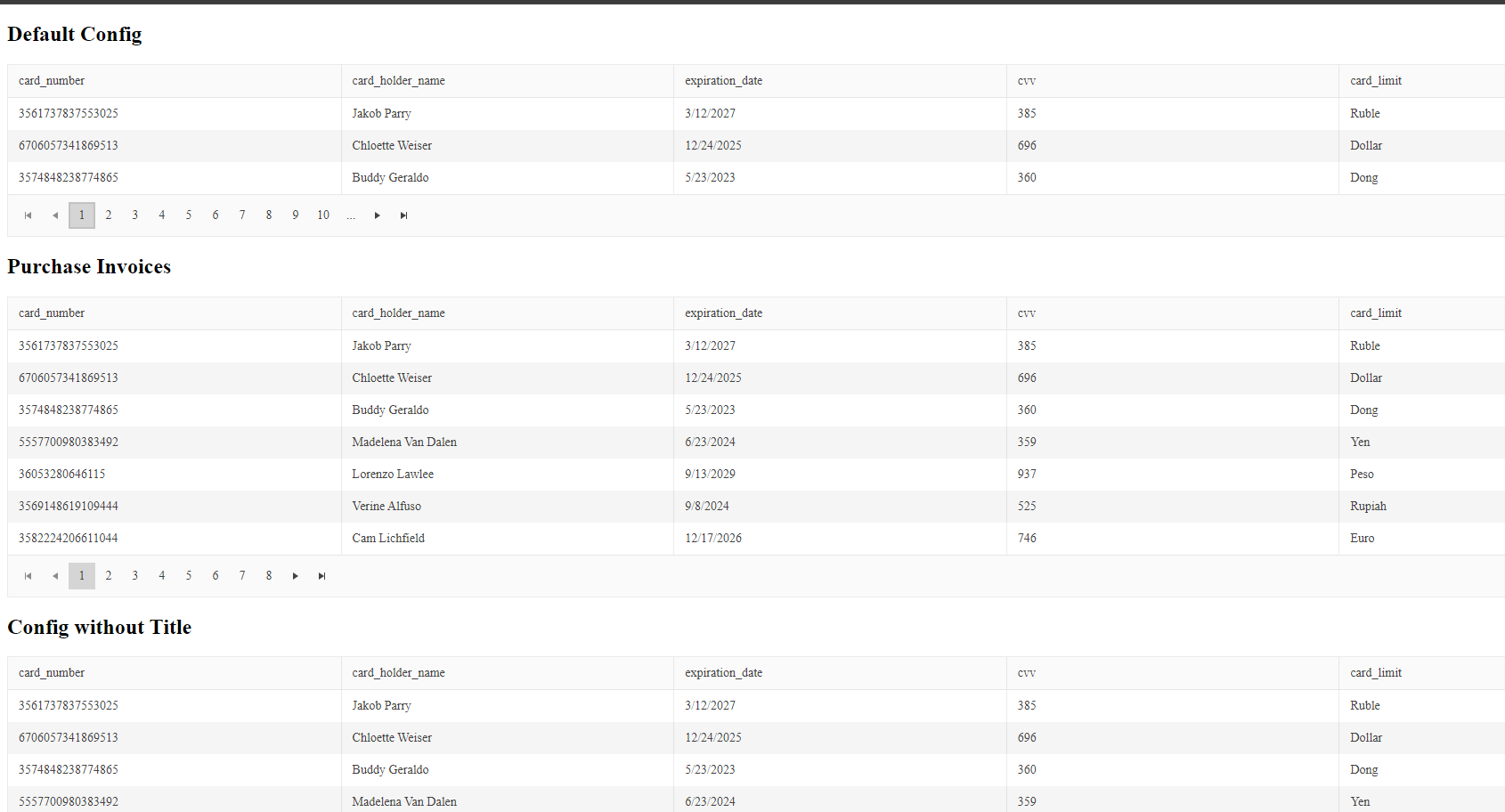
<h2>{{kendoConfig().title}}</h2>
<kendo-grid
  [kendoGridBinding]="data()"
  [pageable]="kendoConfig().enablePagination"  [pageSize]="kendoConfig().itemsPerPage">
</kendo-grid>
Save the changes, and everything continues working with less code and is easier to read!
Conclusion
We’ve learned that signal inputs are amazing for keeping our code reactive. They work in the same way as the classic @Input, but now they are signal-based, and provide all the same features: required, alias and transform. This approach avoids the use of the ngOnChanges lifecycle hook when we write reactive components using signals!
I highly recommend embracing Signal. You can read more about signals, or you can read the official documentation.
Happy coding!
Dany Paredes
Dany Paredes is a Google Developer Expert on Angular and Progress Champion. He loves sharing content and writing articles about Angular, TypeScript and testing on his blog and on Twitter (@danywalls).
Related Posts
Comments
All articles
Topics
Web MobileMobile
Desktop
Design
Productivity
People
