
The WPF Control Library Developers Trust
Build modern, high-performance desktop apps faster with an MVVM-first, consistent API, pro themes, an industry-leading Data Grid, and document processing, now accelerated by the Telerik AI Coding Assistant.
30-day FREE trial. Free technical support and training during your trial. No credit card required.
The WPF components are also included in Telerik DevCraft bundles. Learn more.
165+ Enterprise-Grade WPF Controls
Build production-ready WPF apps faster with MVVM-ready APIs, virtualization for large data and consistent theming.
Featured Components
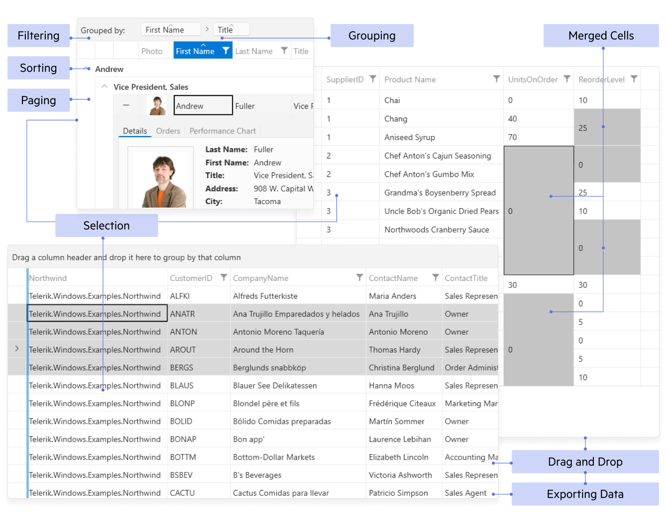
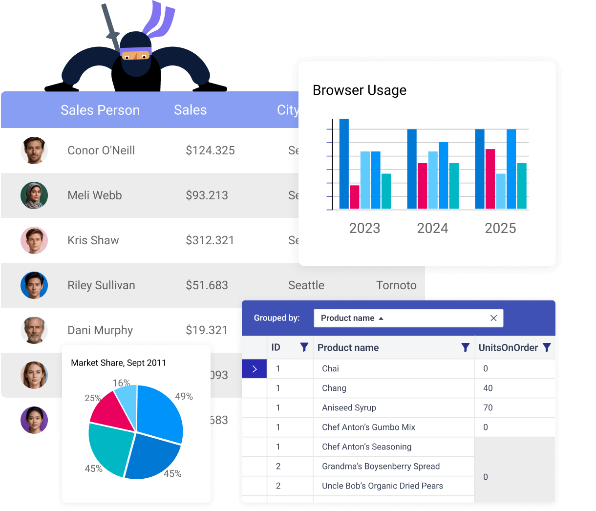
Display and manage large, complex datasets with high performance and full interactivity.
- Virtualized component for great performance and smooth, large-data scrolling
- Inline editing & validation with full CRUD
- Excel-style sorting, filtering, grouping, aggregates
- Keyboard/touch & accessibility
- Themes
- Hierarchy & paging with flexible selection modes
- Templates & columns: custom cells, frozen/reorder/resize, drag-and-drop
- Export to Excel/PDF/CSV via built-in Document Processing
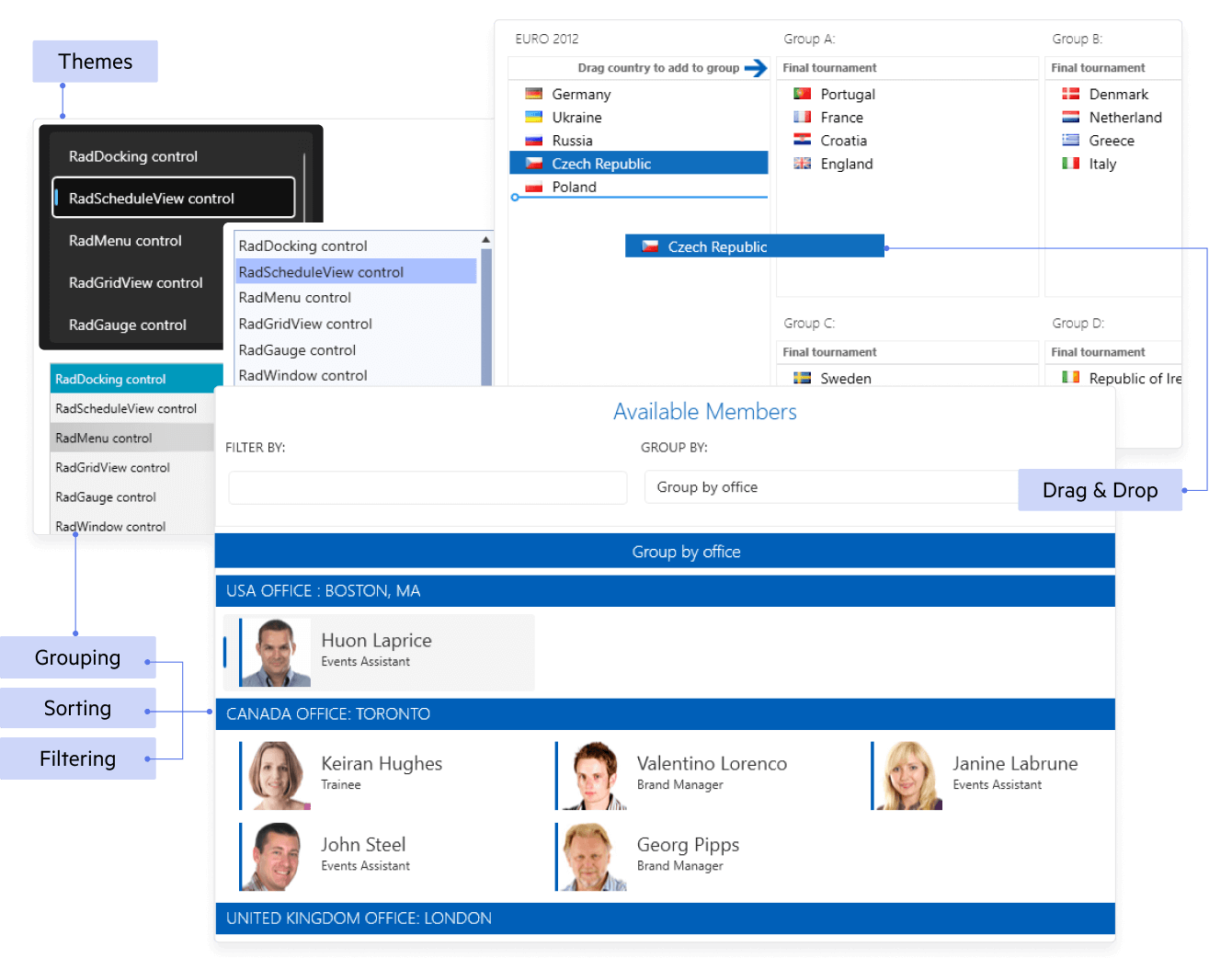
Present large, selectable lists with rich templating and smooth performance.
- Virtualized component for great performance and smooth, large-data scrolling
- MVVM-friendly data binding (ObservableCollection, commands)
- Rich selection: single, multiple, extended; optional checkboxes
- Drag-and-drop to reorder or move items between lists
- Item templates & styling for images, badges, custom layouts
- Keyboard/touch & accessibility
- Themes
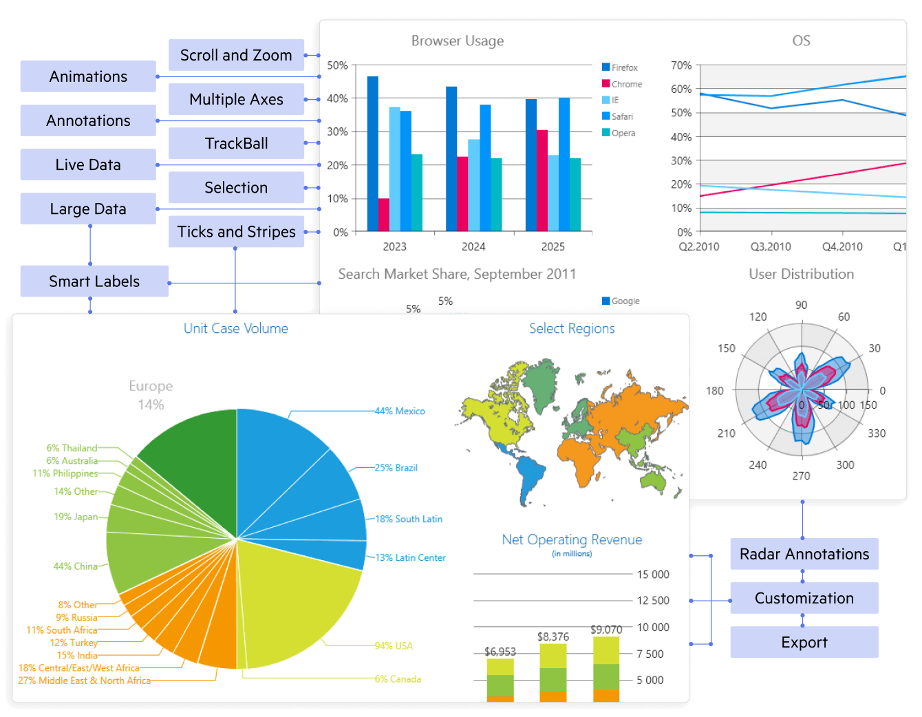
Plot interactive, high-performance charts for dashboards and analytics.
- 20+ chart types: line/area, bar/column, pie/donut, scatter/bubble, financial, polar
- Fast rendering with virtualization and live updates
- Pan/zoom & trackball with tooltips, legends, labels
- Multiple/secondary axes, logarithmic, stacking & 100% stacking
- Annotations & trendlines for insights
- MVVM binding & theming with optional export to image
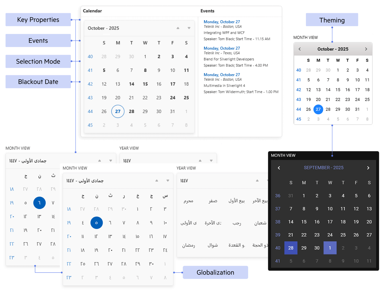
Clean, flexible date selection with rich templating and localization.
- Single, multiple & range selection
- Multi-month views with fast decade/century navigation
- Blackout/special days with custom styling
- Culture & timezone aware
- MVVM binding for selected dates, commands
- Keyboard/touch & theming
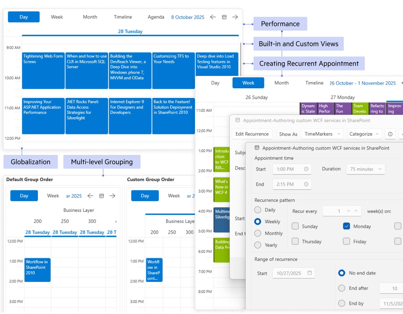
Plan and visualize appointments, resources and timelines.
- Day/Week/Month/Timeline views (optional agenda)
- Recurring appointments with exceptions
- Resource grouping (people/rooms) and multi-schedule
- Drag, resize & inline edit with snapping
- Time zones, working hours & special slots
- MVVM binding & templates with keyboard/touch and theming
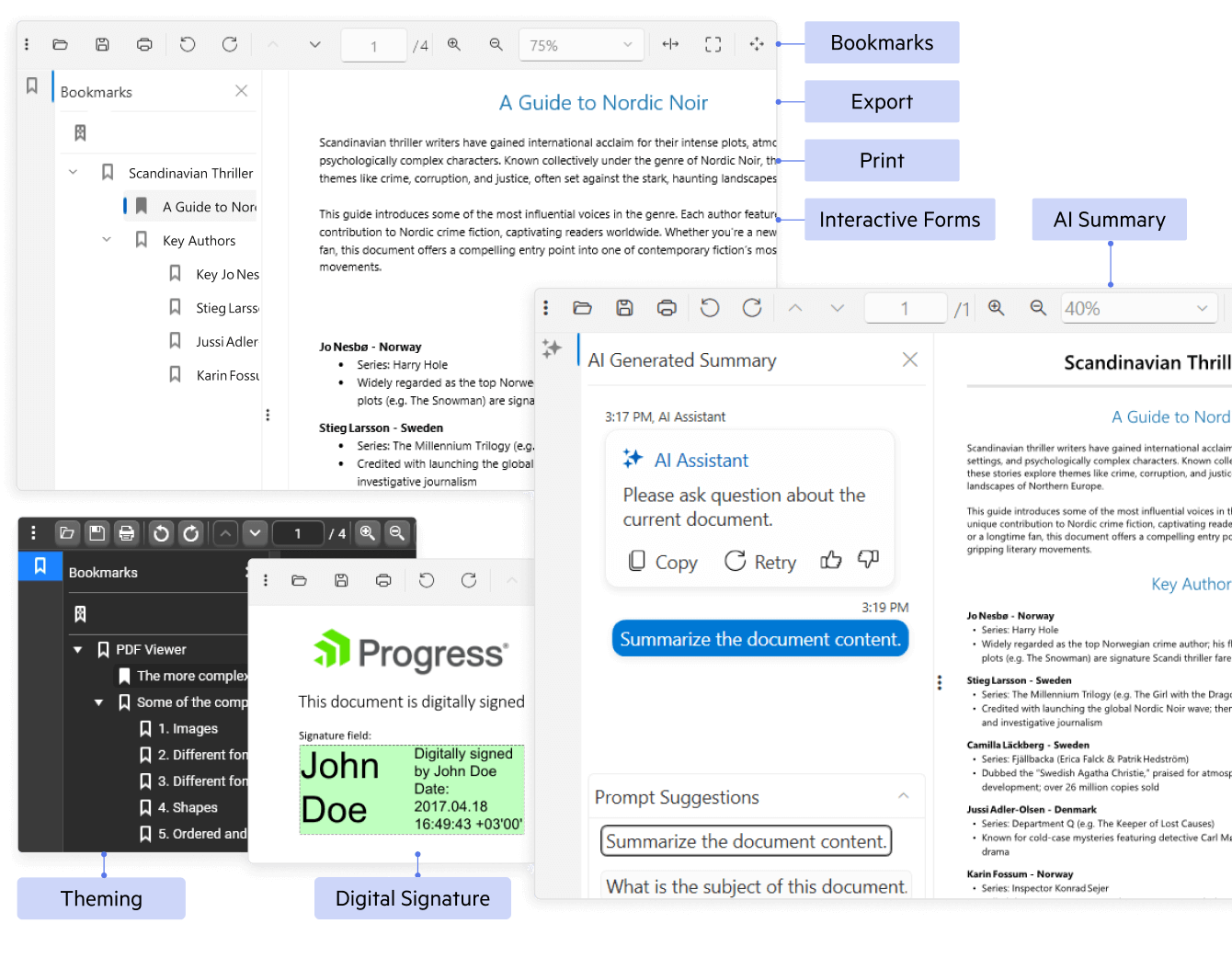
View and interact with PDFs inside your WPF app with no external dependencies.
- Fast, accurate rendering with smooth paging
- Text select & search, zoom and pan
- Thumbnails, bookmarks & links for quick navigation
- Interactive forms fill/submit
- Print & export pages/images (Document Processing)
- Password-protected & digital signatures (view/validate)
- AI-Powered PDF Querying and Summarization
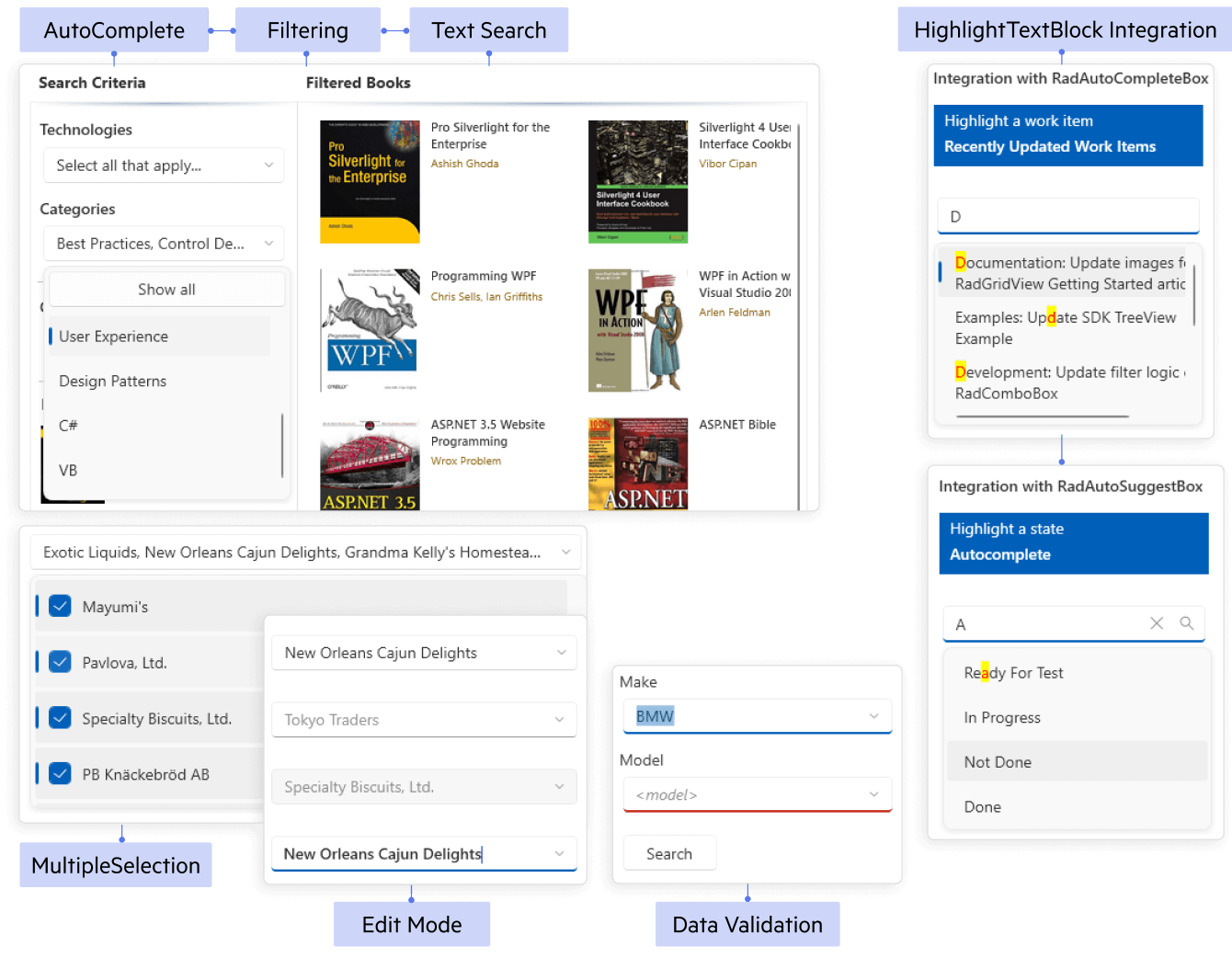
Fast, flexible item selection with rich templating and filtering.
- Virtualized & load-on-demand for large lists
- Editable + autocomplete with contains/starts-with filtering
- Single or multi-select (optional checkboxes)
- Cascading & MVVM binding with grouping/sorting
- Custom templates (items, header/footer, dropdown)
- Keyboard/touch, accessibility & theming
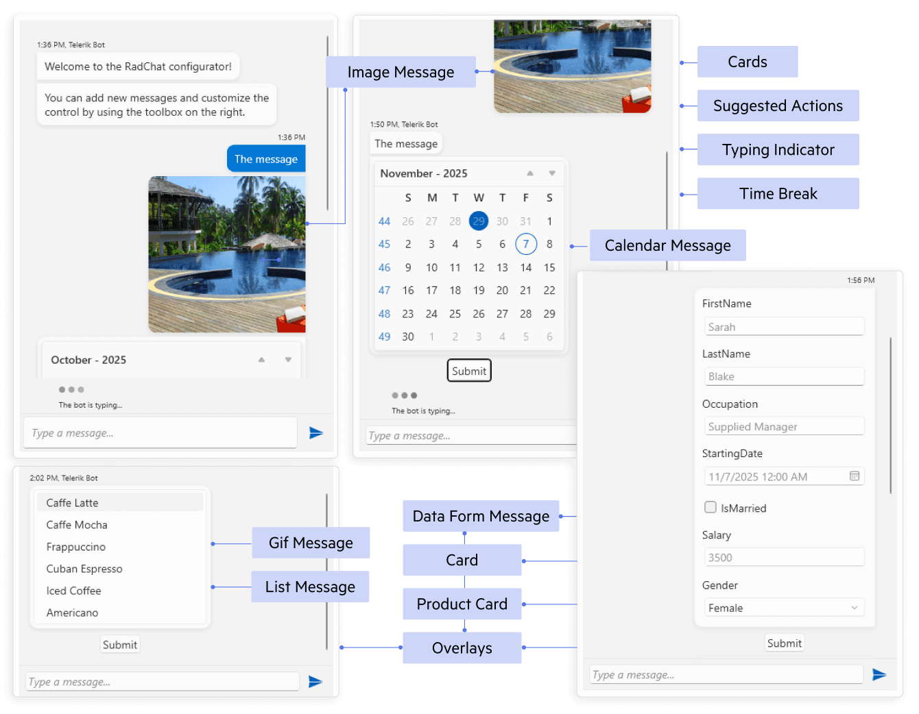
Add modern chat experiences for bots or live support.
- Rich messages: text, images, cards, emoji
- Suggested actions & quick replies
- File attachments and hyperlinks
- Typing status, timestamps & avatars
- MVVM-friendly templates for messages/users
- See WPF Documentation for Conversation UI
Unprecedented Productivity with AI Coding
The Telerik UI AI Coding Assistant is specifically trained on the Telerik UI for WPF component library to ensure developers get production-quality code when working in their favorite IDE. It’s like having an extra team member who:
- Automates repetitive tasks such as generating code for adding new and configuring existing components.
- Finds answers to questions from the API documentation and other knowledge repositories.
- Troubleshoots problems related to the component libraries.

Telerik AI Coding Assistant - Overview
Why Developers Choose Telerik UI for WPF
Get more done with fewer headaches - faster development, rock-solid performance and enterprise-grade support.
Complete WPF UI Suite (165+), MVVM-Ready
Ship full apps faster with 165+ polished WPF controls - grid, charts, schedulers, editors, ribbons, dialogs and more, all built on a consistent, MVVM-first API. Reuse patterns across the suite to keep code clean, testable and easy to maintain.
Virtualization & Smooth UX
Deliver fast, polished UX on massive datasets. Virtualization, async data ops and lightweight templates keep scrolling fluid, while first-class touch/keyboard/mouse and auto HiDPI keep the UI crisp on 4K and ultra-wide displays.
Pro Data Grid + Document Processing
Handle heavy data with an industry-leading Data Grid: filtering, grouping, sorting, summaries, hierarchy and 100+ pro features. Create, read and export text, spreadsheet and PDF with built-in Document Processing with no external dependencies.
Themes, Accessibility & Premium Support
Modern, customizable Office/Windows/VS themes; accessible and UIA-compliant controls. Controls meet accessibility and UIA standards. Count on frequent releases, comprehensive documentation, responsive support and clear subscription or perpetual licensing.
See Telerik UI for WPF in Action
Explore desktop demo apps that showcase what you can build with 165+ controls. Try real features and open the included source code for every example.

WPF Demo Application
This application demonstrates a variety of WPF controls and features.


CRM APP
The Customer Relationship Management (CRM) sample application showcases a modern UI and real-time responsiveness while handling huge sets of data.
Explore All 165+ WPF UI Controls
Build rich WPF apps faster with 165+ production-ready controls, optimized for performance, scalability and great UX.
The companies that trust Telerik and Kendo UI products include:


What Developers Say
The support is excellent! They even solve problems when the fault is in the code and not the control. The response time is excellent and they are almost always very accurate in their answers.
The UI library allows for rapid development of native applications in WPF and WinForms (the two main platforms I use). It reduces the complexity particularly when formatting and customizing the controls.
Nice looking controls with minimal effort. I am using the UI controls from Telerik UI for WPF. I like the documentation, you can find most of the things you need in the documentation. All the controls look modern. At work we are using Fluent theme that I like very much.
I love that Telerik provides a lot of examples and solutions to common cases and when you have complicated scenarios you can fill a ticket to customer support.
All controls are easy to use in the company solution and we are using them all the time.
Using Telerik speeds up development. It prevents having to manage a number of controls that could be abandoned, and gives a unified look and feel to the end product. Very easy to integrate to ASP.Net Core and WPF. Quick to implement. Support has been good.
Providing controls that aren't native to frameworks and platforms and speeding up development by pre-solving problems is great benefit. The code examples are also helpful for doing non-standard things.
Huge set of controls with lots of features. I'm mainly using the WPF controls by Telerik. These are in general very good and cover a lot of functionalities to create modern, flexible UIs. What also needs to be said is that the tech support is very good. You get an answer within 24 hours and very often ready to use sample code is included with the answers. Telerik is great for creating modern UIs.
Telerik is the best UI Suite for WPF.
I like best the Support and the really qualified Support people. Our whole Software (ERP, CRM, Transport Management) uses Telerik on all edges, so Telerik is a huge benefit for us.
(We) create beautiful software. We have been using Telerik components for 15+ years and the continuous evolution of the products (Silverlight, --> WPF --> Blazor), rock solid support and exceptional documentation and resources makes it a no-brainer renewal each year. Telerik solves the UI/UX so I can focus on solving the business problem. Most of our work is bespoke development.
Awards
Greatness—it’s one thing to say you have it, but it means more when others recognize it. Telerik is proud to hold the following industry awards.


Industry-Leading Support
Expert and Timely Response
Get answers to your questions directly from the developers who build Telerik Reporting, even during your trial period.
Contact SupportNeed Evaluation Help?
If you are not a developer or don’t have time to evaluate our product, send us your project requirements. We will evaluate your required features and let you know how our products fit your needs.
Send Us Your RequirementsMore Than Just a WPF Component Library
Visual Studio Extensions
The Telerik UI for WPF extensions handle the following major points in the development with Telerik UI for WPF:
- Project creation, conversion, and configuration
- Project upgrade
- Common scenario page creation
- Toolbox configuration

Embedded Reporting
Transforming raw data into actionable insights is the core function of reporting. Simplify development workflow with an intuitive embedded reporting tool that helps developers enable business users to easily create, edit and view reports on their own. Embed Reporting into WPF, WinForms, ASP.NET Core, Angular, React, Blazor, and more apps. You can buy Telerik UI for WPF and Reporting in DevCraft Complete and Ultimate bundles.
Learn more about Telerik Reporting Explore Embedded Reporting for Business Users Check out Report Designers Check out Report Viewers
Video Course
Telerik courses on YouTube provide step-by-step video tutorials for a variety of .NET and JavaScript products. It is the perfect place to get started with Telerik UI for WPF and accelerate your onboarding process.
From installation to advanced features, this video course equips you with the essential skills and knowledge to kickstart your WPF journey.
Learn More

Ready to Level Up Your WPF Game?
30-day FREE trial. Free technical support during your trial. No credit card required.
WPF components are also included in Telerik DevCraft bundles. Learn more.