
UI for WPF
WPF CollectionNavigator
- The Telerik CollectionNavigator is part of the powerful UI for WPF data management framework and allows for seamless editing and navigation of data collections.
- Part of the Telerik UI for WPF library along with 160+ professionally-designed UI controls.
- Includes support, documentation, demos, virtual classrooms, Visual Studio Extensions and more!
-
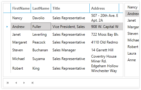
Seamless Editing and Navigation of Data Collections
The Telerik CollectionNavigator provides UI for seamless editing and navigation of а given data collection. The Navigator comes with pre-defined themes, easily customizable UI, styling and appearance as well as UI automation support.
Visit the Getting Started section of the product documentation -
Editing and Navigation
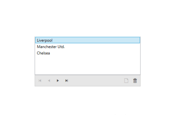
RadCollectionNavigator provides UI for editing and navigation of a given data collection. The control displays two sets of buttons.
Navigation buttons include:
- Move to first item
- Move to previous item
- Move to next item
- Move to last item
- Add new item
- Edit current item
- Delete item
Editing buttons include:
-
Built-In Themes
Seamless styling is right at your fingertips. Use any of the 20+ built-in themes that come with UI for WPF to customize the look and feel of the CollectionNavigator. You can also design your own templates for a completely custom look.
Visit the product documentation for more information on how to customize the component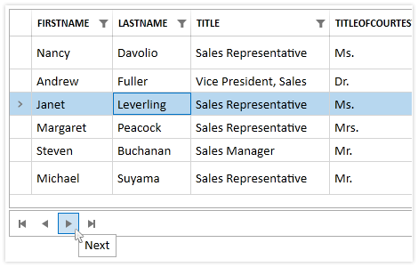
-
UI Automation Support
Telerik CollectionNavigator provides built-in support for Microsoft UI Automation. UI Automation support is implemented throughout the entire Telerik UI for WPF suite.
Visit the UI Automation Support article of the product documentation for more information
