UI for WinForms
WinForms DropDownList
- The Telerik DropDownList lets you control its data source, visual and data behavior as well as its scrolling logic. With support for filtering, sorting, auto-complete and many other features it allows for complete customization to fit your scenario.
- Part of the Telerik UI for WinForms library along with 160+ professionally-designed UI controls.
- Includes support, documentation, demos, virtual classrooms, Visual Studio Extensions and more!

-
Full-featured DropDownList Control for WinForms Applications
Telerik DropDownList for Windows Forms is the Telerik version of the standard combobox control. It is a versatile combination of an editing field (RadTextBox) combined with a drop-down list, which allows for looking up and selecting data from the list. The TextBox can be set to accept free-form data input, thus triggering the auto complete mode, or can be read-only and thus forcing the user to select from the entries in the drop-down list.
-
Overview
Telerik DropDownList for Windows Forms is the Telerik version of the standard combobox control. It is a versatile combination of an editing field (RadTextBox) combined with a drop-down list (RadListControl), which allows for looking up and selecting data from the list. The TextBox can be set to accept free-form data input, thus triggering the auto complete mode, or can be read-only and thus forcing the user to select from the entries in the drop-down list.
The controls are tightly coupled to work seamlessly together. The DropDownList and the ListControl share the same structure and properties, virtually eliminating the time you will need to learn a second product, thus increasing your ROI and making development easier than ever.
-
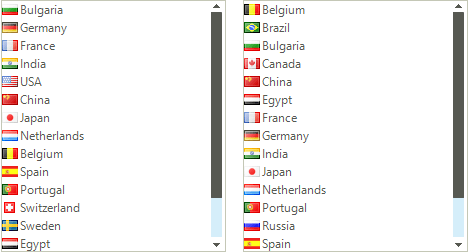
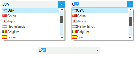
Filtering
Telerik DropDownList and ListControl allow you to filter data by applying a pre-defined filter pattern. The user can filter the combobox items in order to easily find what he/she is searching for. The controls can be configured to filter the items that start with the specified text, or the items that contain the specified text. -
Item size and customization
An item’s height can be either automatically calculated by the control or predefined to a certain value. You can also customize an item’s appearance (colors, fonts, text and image relation and so on) using the formatting events, and you can completely replace visual items with custom ones. RadListControl also has built-in alternating item color functionality, for a better user experience. -
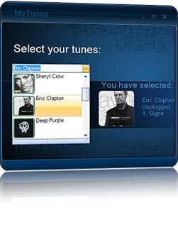
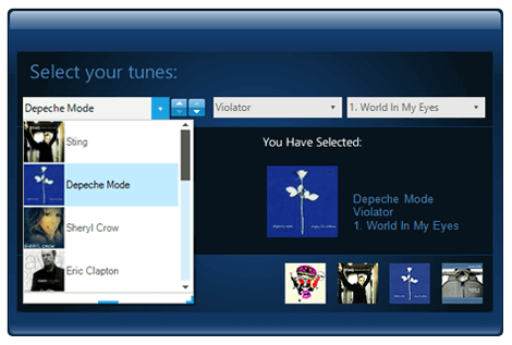
Description Items
In addition to the default items holding a single line of text, the control features DescriptionTextListDataItems, which enables you to add another element with description text. -
Keyboard Support
RadDropDownList and RadListControl by Telerik deliver convenience through integrated keyboard support. Once the control gets into focus, you can use the arrow keys to navigate through the items.
In addition, the underlying list also supports keyboard search functionality, which enables you to navigate to a particular item by starting to type its text. Or, if you press a single character, it navigates to the first item starting with that character, just like in Windows Explorer. -
Excellent Databinding Performance
Telerik Windows Forms DropDownList and ListControl come with a flexible data binding mechanism including support for binding to any object that implements IList, IListSource or IBindingList. This includes generic lists, arrays, and BindingSource. By using virtualization, the controls can be bound to thousands of items in milliseconds, re-enforcing Telerik's commitment to excellent performance without sacrificing features.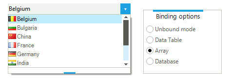
-
Localization and Right-to-Left Language Support
Telerik DropDownList and ListControl provide full support for Right-to-Left languages, as well as localization support. See Localization and Right-to-Left Support for the full list of Telerik Windows Forms controls supporting RTL languages and localization.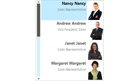
-
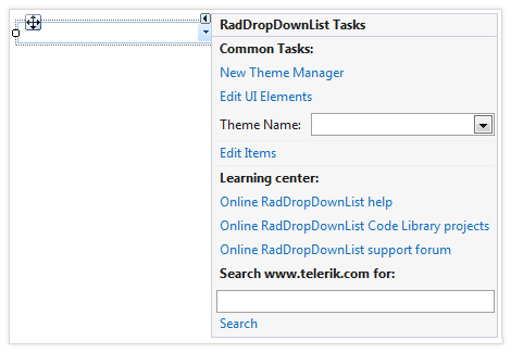
Extensive VS.NET Design-time Support
DropDownList provides rich design-time support, making customizations and configurations very easy. Some key capabilities include:
- Adding and removing items from the control using only the Visual Studio designer
- Populating new items or modifying existing ones by exposing the link to open the items collection in SmartTag
- Applying themes in design time and easily switching between them; the ThemeName property in the Smart tag automatically detects the present themes
- Visual Style Builder, Element Hierarchy Editor and Shape Editor productivity tools for full control over the UI
- Options to search the forums or open online documentation in the Smart Tag
-
Autocomplete Modes
Telerik DropDownList comes with full autocomplete support, but it is up to you to decide whether users can enter free-form data or just select from the entries in the drop-down list. A single property setting switches editing on or off, making the text box section of the control editable or read-only.
When in editing mode the DropDownList selects or prefills the matching entry from the list as soon as the user starts typing. The different autocomplete modes are Suggest, Append, SuggestAppend, and Off. If you are using multi-line item text, the DropDownList uses the title label only, making programming and operation easier.
-
Rotating List Items on Double-Click
Double-click on the text box in a Telerik DropDownList and it will pull up the next item from the list. This timesaving feature allows your users to quickly advance through a list without the need to see all items. -
Appearance
The controls are shipped with a rich set of pixel-perfect themes that allow you to easily build slick interfaces with the look-and-feel of Windows 8, Office 2010, Office 2013, Metro, etc. The themes can be easily switched using a single property. You can tweak existing themes or build a new theme from scratch to fit your exact visual demands by using the Visual Style Builder productivity tool. A well-thought light element tree allows for easy and intuitive styling.
The DropDownList and ListControl are also capable of displaying images, text, multiline text, and rich text by using standard HTML tags, such as <i>, <b>, and <u>.
Telerik DropDownList supports a variety of expand animation styles for a great user experience. You can select among predefined drop down animations and further customize them to fit your scenario.
-
Sorted Lists
Telerik Windows Forms DropDownList and ListControl support automatic sorting, based on the Sorted property of the control - simply set it to Ascending or Descending to sort in the respective order, or deactivate it to restore the initial ordering of the ItemCollection. Sorting may be case-sensitive or case-insensitive. Capital letters are displayed first in the former case.