17 Answers, 1 is accepted

You can set the RadExpander DecoratorTemplate property which controls the expander button template. I prepared a sample project illustrating this approach. Have a look at it and let me know if it works for you.
Greetings,
Tina Stancheva
the Telerik team

 Rank 1
With the Q1 2011 release we introduced some changes in the RadExpander control in order to improve its performance. However, some of the changes affected the ControlTemplate of the RadExpander. I attached a sample project illustrating how to customize the expand button with the latest version of the controls.
All the best,
Tina Stancheva
the Telerik team
Rank 1
I think it would be great to use a company logo for this. Is there any way one can use an image instead of messing about with themes. I have downloaded the expander zips but none will run or show anything in design view. Please, just a gif would do.
mike
I am not sure I understand your issue. But if you need to define an Image in the RadExpander Header, you can use the following style for the control:
<UserControl.Resources> <SolidColorBrush x:Key="Expander_Background" Color="#00FFFFFF" /> <SolidColorBrush x:Key="Expander_BorderBrush" Color="#00FFFFFF" /> <Thickness x:Key="Expander_BorderThickness">0</Thickness> <LinearGradientBrush x:Key="ControlBackground_Normal" StartPoint="0.5,0" EndPoint="0.5,1"> <GradientStop Offset="0" Color="#FFFFFFFF" /> <GradientStop Offset="0.50" Color="#FFDCDCDC" /> <GradientStop Offset="0.50" Color="#FFADADAD" /> <GradientStop Offset="1" Color="#FFD4D4D4" /> </LinearGradientBrush> <SolidColorBrush x:Key="ControlOuterBorder_Normal" Color="#FF848484" /> <SolidColorBrush x:Key="ControlInnerBorder_Normal" Color="#FFFFFFFF" /> <SolidColorBrush x:Key="ControlElement_Normal" Color="#FF000000" /> <SolidColorBrush x:Key="ControlOuterBorder_Focused" Color="#FFFFC92B" /> <ControlTemplate x:Key="ToggleTemplate" TargetType="telerik:RadToggleButton"> <Grid> <VisualStateManager.VisualStateGroups> <VisualStateGroup x:Name="FocusStates"> <VisualStateGroup.Transitions> <VisualTransition GeneratedDuration="0:0:0.2" To="Focused" /> <VisualTransition GeneratedDuration="0:0:0.2" To="Unfocused" /> </VisualStateGroup.Transitions> <VisualState x:Name="Unfocused" /> <VisualState x:Name="Focused"> <Storyboard> <ObjectAnimationUsingKeyFrames Duration="0:0:0" Storyboard.TargetName="FocusDecorator" Storyboard.TargetProperty="Visibility"> <DiscreteObjectKeyFrame KeyTime="0:0:0" Value="Visible" /> </ObjectAnimationUsingKeyFrames> </Storyboard> </VisualState> </VisualStateGroup> </VisualStateManager.VisualStateGroups> <ContentPresenter x:Name="Content" Margin="{TemplateBinding Padding}" HorizontalAlignment="{TemplateBinding HorizontalContentAlignment}" VerticalAlignment="{TemplateBinding VerticalContentAlignment}" Content="{TemplateBinding Content}" ContentTemplate="{TemplateBinding ContentTemplate}" /> <Rectangle x:Name="FocusDecorator" IsHitTestVisible="false" Stroke="{StaticResource ControlOuterBorder_Focused}" StrokeDashArray="1 2" StrokeThickness="1" Visibility="Collapsed" /> </Grid> </ControlTemplate> <SolidColorBrush x:Key="ControlOuterBorder_Disabled" Color="#FF989898" /> <SolidColorBrush x:Key="ControlInnerBorder_Disabled" Color="Transparent" /> <SolidColorBrush x:Key="ControlBackground_Disabled" Color="#FFE0E0E0" /> <SolidColorBrush x:Key="ControlElement_Disabled" Color="#FF8D8D8D" /> <SolidColorBrush x:Key="ControlOuterBorder_MouseOver" Color="#FFFFC92B" /> <SolidColorBrush x:Key="ControlInnerBorder_MouseOver" Color="#FFFFFFFF" /> <LinearGradientBrush x:Key="ControlBackground_MouseOver" StartPoint="0.5,0" EndPoint="0.5,1"> <GradientStop Offset="0" Color="#FFFFFBDA" /> <GradientStop Offset="0.50" Color="#FFFEEBAE" /> <GradientStop Offset="0.50" Color="#FFFFD25A" /> <GradientStop Offset="1" Color="#FFFFFBA3" /> </LinearGradientBrush> <SolidColorBrush x:Key="ControlElement_MouseOver" Color="#FF000000" /> <LinearGradientBrush x:Key="ControlOuterBorder_Pressed" StartPoint="0.5,0" EndPoint="0.5,1"> <GradientStop Color="#FF282828" /> <GradientStop Offset="1" Color="#FF5F5F5F" /> </LinearGradientBrush> <LinearGradientBrush x:Key="ControlInnerBorder_Pressed" StartPoint="0.5,0" EndPoint="0.5,1"> <GradientStop Color="#FFB69A78" /> <GradientStop Offset="0.126" Color="#FFFFE17A" /> </LinearGradientBrush> <LinearGradientBrush x:Key="ControlBackground_Pressed" StartPoint="0.5,0" EndPoint="0.5,1"> <GradientStop Offset="0" Color="#FFFFDCAB" /> <GradientStop Offset="0.5" Color="#FFFFD18F" /> <GradientStop Offset="0.5" Color="#FFFE9227" /> <GradientStop Offset="0" Color="#FFFFBA74" /> </LinearGradientBrush> <SolidColorBrush x:Key="ControlElement_Pressed" Color="#FF000000" /> <ControlTemplate x:Key="ExpanderTemplate" TargetType="telerik:RadExpander"> <Grid HorizontalAlignment="{TemplateBinding HorizontalAlignment}" VerticalAlignment="{TemplateBinding VerticalAlignment}"> <VisualStateManager.VisualStateGroups> <VisualStateGroup x:Name="CommonStateGroup"> <VisualState x:Name="Normal" /> <VisualState x:Name="Disabled"> <Storyboard> <DoubleAnimation Storyboard.TargetName="arrow" Storyboard.TargetProperty="Opacity" To=".5" /> <DoubleAnimation Storyboard.TargetName="Content" Storyboard.TargetProperty="Opacity" To=".5" /> <DoubleAnimation Storyboard.TargetName="HeaderContent" Storyboard.TargetProperty="Opacity" To=".5" /> </Storyboard> </VisualState> </VisualStateGroup> <VisualStateGroup x:Name="HeaderStateGroup"> <VisualState x:Name="NormalHeader" /> <VisualState x:Name="MouseOverHeader" /> <VisualState x:Name="PressedHeader"/> </VisualStateGroup> <VisualStateGroup x:Name="HeaderOrientationGroup"> <VisualState x:Name="HorizontalOrientation"> <Storyboard> <ObjectAnimationUsingKeyFrames Storyboard.TargetName="HeaderContentTransform" Storyboard.TargetProperty="LayoutTransform"> <DiscreteObjectKeyFrame KeyTime="0"> <DiscreteObjectKeyFrame.Value> <RotateTransform Angle="0" /> </DiscreteObjectKeyFrame.Value> </DiscreteObjectKeyFrame> </ObjectAnimationUsingKeyFrames> <ObjectAnimationUsingKeyFrames Storyboard.TargetName="HeaderContentTransform" Storyboard.TargetProperty="(Grid.Column)"> <DiscreteObjectKeyFrame KeyTime="0" Value="1" /> </ObjectAnimationUsingKeyFrames> </Storyboard> </VisualState> <VisualState x:Name="VerticalOrientation"> <Storyboard> <ObjectAnimationUsingKeyFrames Storyboard.TargetName="HeaderContentTransform" Storyboard.TargetProperty="LayoutTransform"> <DiscreteObjectKeyFrame KeyTime="0"> <DiscreteObjectKeyFrame.Value> <RotateTransform Angle="90" /> </DiscreteObjectKeyFrame.Value> </DiscreteObjectKeyFrame> </ObjectAnimationUsingKeyFrames> <ObjectAnimationUsingKeyFrames Storyboard.TargetName="HeaderContentTransform" Storyboard.TargetProperty="(Grid.Row)"> <DiscreteObjectKeyFrame KeyTime="0" Value="1" /> </ObjectAnimationUsingKeyFrames> </Storyboard> </VisualState> </VisualStateGroup> <VisualStateGroup x:Name="ExpandStateGroup"> <VisualState x:Name="Expanded"> <Storyboard> <ObjectAnimationUsingKeyFrames Storyboard.TargetName="Content" Storyboard.TargetProperty="Visibility"> <DiscreteObjectKeyFrame KeyTime="0" Value="Visible" /> </ObjectAnimationUsingKeyFrames> <DoubleAnimation Duration="0:0:0.2" Storyboard.TargetName="arrow" Storyboard.TargetProperty="(FrameworkElement.RenderTransform).Angle" To="180" /> </Storyboard> </VisualState> <VisualState x:Name="Collapsed"> <Storyboard> <ObjectAnimationUsingKeyFrames Storyboard.TargetName="Content" Storyboard.TargetProperty="Visibility"> <DiscreteObjectKeyFrame KeyTime="0" Value="Collapsed" /> </ObjectAnimationUsingKeyFrames> <DoubleAnimation Duration="0:0:0.2" Storyboard.TargetName="arrow" Storyboard.TargetProperty="(FrameworkElement.RenderTransform).Angle" To="0" /> </Storyboard> </VisualState> </VisualStateGroup> <VisualStateGroup x:Name="ExpandDirectionStates"> <VisualStateGroup.Transitions> <VisualTransition> <Storyboard> <ObjectAnimationUsingKeyFrames Storyboard.TargetName="Content" Storyboard.TargetProperty="(Grid.Row)"> <DiscreteObjectKeyFrame KeyTime="0" Value="0" /> </ObjectAnimationUsingKeyFrames> <ObjectAnimationUsingKeyFrames Storyboard.TargetName="Content" Storyboard.TargetProperty="(Grid.Column)"> <DiscreteObjectKeyFrame KeyTime="0" Value="0" /> </ObjectAnimationUsingKeyFrames> <ObjectAnimationUsingKeyFrames Storyboard.TargetName="Content" Storyboard.TargetProperty="(Grid.RowSpan)"> <DiscreteObjectKeyFrame KeyTime="0" Value="1" /> </ObjectAnimationUsingKeyFrames> <ObjectAnimationUsingKeyFrames Storyboard.TargetName="Content" Storyboard.TargetProperty="(Grid.ColumnSpan)"> <DiscreteObjectKeyFrame KeyTime="0" Value="1" /> </ObjectAnimationUsingKeyFrames> <ObjectAnimationUsingKeyFrames Storyboard.TargetName="HeaderButton" Storyboard.TargetProperty="(Grid.Row)"> <DiscreteObjectKeyFrame KeyTime="0" Value="0" /> </ObjectAnimationUsingKeyFrames> <ObjectAnimationUsingKeyFrames Storyboard.TargetName="HeaderButton" Storyboard.TargetProperty="(Grid.Column)"> <DiscreteObjectKeyFrame KeyTime="0" Value="0" /> </ObjectAnimationUsingKeyFrames> <ObjectAnimationUsingKeyFrames Storyboard.TargetName="HeaderButton" Storyboard.TargetProperty="(Grid.RowSpan)"> <DiscreteObjectKeyFrame KeyTime="0" Value="1" /> </ObjectAnimationUsingKeyFrames> <ObjectAnimationUsingKeyFrames Storyboard.TargetName="HeaderButton" Storyboard.TargetProperty="(Grid.ColumnSpan)"> <DiscreteObjectKeyFrame KeyTime="0" Value="1" /> </ObjectAnimationUsingKeyFrames> </Storyboard> </VisualTransition> </VisualStateGroup.Transitions> <VisualState x:Name="DirectionDown"> <Storyboard> <DoubleAnimation Duration="0:0:0" Storyboard.TargetName="arrowPanel" Storyboard.TargetProperty="(FrameworkElement.RenderTransform).Angle" To="90" /> <ObjectAnimationUsingKeyFrames Storyboard.TargetName="Content" Storyboard.TargetProperty="(Grid.Row)"> <DiscreteObjectKeyFrame KeyTime="0" Value="1" /> </ObjectAnimationUsingKeyFrames> <ObjectAnimationUsingKeyFrames Storyboard.TargetName="Content" Storyboard.TargetProperty="(Grid.ColumnSpan)"> <DiscreteObjectKeyFrame KeyTime="0" Value="2" /> </ObjectAnimationUsingKeyFrames> <ObjectAnimationUsingKeyFrames Storyboard.TargetName="HeaderButton" Storyboard.TargetProperty="(Grid.ColumnSpan)"> <DiscreteObjectKeyFrame KeyTime="0" Value="2" /> </ObjectAnimationUsingKeyFrames> </Storyboard> </VisualState> <VisualState x:Name="DirectionUp"> <Storyboard> <ObjectAnimationUsingKeyFrames Storyboard.TargetName="row1" Storyboard.TargetProperty="Height"> <DiscreteObjectKeyFrame KeyTime="0" Value="*" /> </ObjectAnimationUsingKeyFrames> <ObjectAnimationUsingKeyFrames Storyboard.TargetName="row2" Storyboard.TargetProperty="Height"> <DiscreteObjectKeyFrame KeyTime="0" Value="Auto" /> </ObjectAnimationUsingKeyFrames> <ObjectAnimationUsingKeyFrames Storyboard.TargetName="HeaderButton" Storyboard.TargetProperty="(Grid.Row)"> <DiscreteObjectKeyFrame KeyTime="0" Value="1" /> </ObjectAnimationUsingKeyFrames> <ObjectAnimationUsingKeyFrames Storyboard.TargetName="Content" Storyboard.TargetProperty="(Grid.ColumnSpan)"> <DiscreteObjectKeyFrame KeyTime="0" Value="2" /> </ObjectAnimationUsingKeyFrames> <DoubleAnimation Duration="0:0:0" Storyboard.TargetName="arrowPanel" Storyboard.TargetProperty="(FrameworkElement.RenderTransform).Angle" To="-90" /> <ObjectAnimationUsingKeyFrames Storyboard.TargetName="HeaderButton" Storyboard.TargetProperty="(Grid.ColumnSpan)"> <DiscreteObjectKeyFrame KeyTime="0" Value="2" /> </ObjectAnimationUsingKeyFrames> </Storyboard> </VisualState> <VisualState x:Name="DirectionLeft"> <Storyboard> <ObjectAnimationUsingKeyFrames Storyboard.TargetName="column1" Storyboard.TargetProperty="Width"> <DiscreteObjectKeyFrame KeyTime="0" Value="*" /> </ObjectAnimationUsingKeyFrames> <ObjectAnimationUsingKeyFrames Storyboard.TargetName="column2" Storyboard.TargetProperty="Width"> <DiscreteObjectKeyFrame KeyTime="0" Value="Auto" /> </ObjectAnimationUsingKeyFrames> <ObjectAnimationUsingKeyFrames Storyboard.TargetName="HeaderButton" Storyboard.TargetProperty="(Grid.Column)"> <DiscreteObjectKeyFrame KeyTime="0" Value="1" /> </ObjectAnimationUsingKeyFrames> <ObjectAnimationUsingKeyFrames Storyboard.TargetName="Content" Storyboard.TargetProperty="(Grid.RowSpan)"> <DiscreteObjectKeyFrame KeyTime="0" Value="2" /> </ObjectAnimationUsingKeyFrames> <DoubleAnimation Duration="0:0:0" Storyboard.TargetName="arrowPanel" Storyboard.TargetProperty="(FrameworkElement.RenderTransform).Angle" To="180" /> <ObjectAnimationUsingKeyFrames Storyboard.TargetName="HeaderButton" Storyboard.TargetProperty="(Grid.RowSpan)"> <DiscreteObjectKeyFrame KeyTime="0" Value="2" /> </ObjectAnimationUsingKeyFrames> </Storyboard> </VisualState> <VisualState x:Name="DirectionRight"> <Storyboard> <ObjectAnimationUsingKeyFrames Storyboard.TargetName="Content" Storyboard.TargetProperty="(Grid.Column)"> <DiscreteObjectKeyFrame KeyTime="0" Value="1" /> </ObjectAnimationUsingKeyFrames> <ObjectAnimationUsingKeyFrames Storyboard.TargetName="Content" Storyboard.TargetProperty="(Grid.RowSpan)"> <DiscreteObjectKeyFrame KeyTime="0" Value="2" /> </ObjectAnimationUsingKeyFrames> <DoubleAnimation Duration="0:0:0" Storyboard.TargetName="arrowPanel" Storyboard.TargetProperty="(FrameworkElement.RenderTransform).Angle" To="0" /> <ObjectAnimationUsingKeyFrames Storyboard.TargetName="HeaderButton" Storyboard.TargetProperty="(Grid.RowSpan)"> <DiscreteObjectKeyFrame KeyTime="0" Value="2" /> </ObjectAnimationUsingKeyFrames> </Storyboard> </VisualState> </VisualStateGroup> </VisualStateManager.VisualStateGroups> <Border Background="{TemplateBinding Background}" BorderBrush="{TemplateBinding BorderBrush}" BorderThickness="{TemplateBinding BorderThickness}"> <Grid x:Name="expanderContainer"> <Grid.ColumnDefinitions> <ColumnDefinition x:Name="column1" Width="Auto" /> <ColumnDefinition x:Name="column2" Width="*" /> </Grid.ColumnDefinitions> <Grid.RowDefinitions> <RowDefinition Height="Auto" x:Name="row1" /> <RowDefinition Height="*" x:Name="row2"/> </Grid.RowDefinitions> <telerik:RadToggleButton x:Name="HeaderButton" HorizontalAlignment="{TemplateBinding HorizontalContentAlignment}" VerticalAlignment="{TemplateBinding VerticalContentAlignment}" Background="Transparent" ClickMode="{TemplateBinding ClickMode}" FontFamily="{TemplateBinding FontFamily}" FontSize="{TemplateBinding FontSize}" FontStretch="{TemplateBinding FontStretch}" FontStyle="{TemplateBinding FontStyle}" FontWeight="{TemplateBinding FontWeight}" HorizontalContentAlignment="{TemplateBinding HorizontalContentAlignment}" IsChecked="{Binding IsExpanded, Mode=TwoWay, RelativeSource={RelativeSource TemplatedParent}}" Template="{StaticResource ToggleTemplate}" VerticalContentAlignment="{TemplateBinding VerticalContentAlignment}"> <Grid x:Name="HeaderPanel"> <Grid.ColumnDefinitions> <ColumnDefinition Width="Auto" /> <ColumnDefinition Width="*" /> </Grid.ColumnDefinitions> <Grid.RowDefinitions> <RowDefinition Height="Auto" /> <RowDefinition Height="*" /> </Grid.RowDefinitions> <Grid Grid.Row="0" Grid.Column="0"> <Grid x:Name="arrowPanel" RenderTransformOrigin=".5 .5"> <Grid.RenderTransform> <RotateTransform /> </Grid.RenderTransform> <Image x:Name="arrow" Width="16" Height="16" RenderTransformOrigin="0.5,0.5" Stretch="None" Source="Expander.png"> <Image.RenderTransform> <RotateTransform Angle="0" /> </Image.RenderTransform> </Image> </Grid> </Grid> <telerik:LayoutTransformControl x:Name="HeaderContentTransform" Grid.Row="0" Grid.Column="0" RenderTransformOrigin=".5 .5"> <ContentPresenter x:Name="HeaderContent" Grid.Column="1" Margin="5 0" HorizontalAlignment="Stretch" VerticalAlignment="Center" Content="{TemplateBinding Header}" ContentTemplate="{TemplateBinding HeaderTemplate}" /> </telerik:LayoutTransformControl> </Grid> </telerik:RadToggleButton> <ContentPresenter x:Name="Content" Margin="{TemplateBinding Padding}" HorizontalAlignment="{TemplateBinding HorizontalContentAlignment}" VerticalAlignment="{TemplateBinding VerticalContentAlignment}" Content="{TemplateBinding Content}" ContentTemplate="{TemplateBinding ContentTemplate}" /> </Grid> </Border> </Grid> </ControlTemplate> <Style x:Key="RadExpanderStyle" TargetType="telerik:RadExpander"> <Setter Property="IsTabStop" Value="false" /> <Setter Property="HorizontalContentAlignment" Value="Stretch" /> <Setter Property="VerticalContentAlignment" Value="Stretch" /> <Setter Property="Background" Value="{StaticResource Expander_Background}" /> <Setter Property="BorderBrush" Value="{StaticResource Expander_BorderBrush}" /> <Setter Property="BorderThickness" Value="{StaticResource Expander_BorderThickness}" /> <Setter Property="Padding" Value="2" /> <Setter Property="Template" Value="{StaticResource ExpanderTemplate}" /> <Setter Property="telerik:AnimationManager.AnimationSelector"> <Setter.Value> <telerik:AnimationSelector> <telerik:ExpanderExpandCollapseAnimation AnimationName="Expand" Direction="In" TargetElementName="Content" /> <telerik:ExpanderExpandCollapseAnimation AnimationName="Collapse" Direction="Out" TargetElementName="Content" /> </telerik:AnimationSelector> </Setter.Value> </Setter> </Style></UserControl.Resources>And if you have the following definition of a RadExpander:
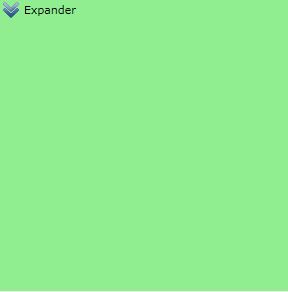
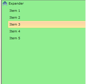
<telerik:RadExpander Header="Expander" HorizontalContentAlignment="Stretch" Style="{StaticResource RadExpanderStyle}" VerticalContentAlignment="Stretch"> <telerik:RadTreeView> <telerik:RadTreeViewItem Header="Item 1" /> <telerik:RadTreeViewItem Header="Item 2" /> <telerik:RadTreeViewItem Header="Item 3" /> <telerik:RadTreeViewItem Header="Item 4" /> <telerik:RadTreeViewItem Header="Item 5" /> </telerik:RadTreeView></telerik:RadExpander>And the Expander.png image is:
 , the layout of the control will look like so:
When Collapsed:
When Expanded:
Is this close to what you have in mind?
Regards,
Tina Stancheva
the Telerik team
Rank 1
We are all over this control template, but the ability to switch this around is alluding us.
For extra bonus points, we also require a property to ensure the Header text would be left or right aligned, as well as take up a MinWidth - which would be properties that we could set in the same way as the Header. I know these would require dependency properties (attached dependency properties?), but although we are experienced with VS, Blend is kicking our butts!
Do you have examples where RadControls are inherited, and additional properties added to handle format? Is this possible?
Help?
You need a Style change and I think using two Styles would be the correct approach in this situation. If you use attached property , it would have to control what style is applied but why not just using the Style property of the RadExpander. Is this suitable for you?
Best wishes,Petar Mladenov
the Telerik team
Thank you for being the most amazing .NET community! Your unfailing support is what helps us charge forward! We'd appreciate your vote for Telerik in this year's DevProConnections Awards. We are competing in mind-blowing 20 categories and every vote counts! VOTE for Telerik NOW >>
Please excuse me for misleading you. Actually, from Q2 2011, we introduced the HorizontalHeaderAlignment property that fits nice in your scenario if you set it to Right.
Kind regards,Petar Mladenov
the Telerik team
Thank you for being the most amazing .NET community! Your unfailing support is what helps us charge forward! We'd appreciate your vote for Telerik in this year's DevProConnections Awards. We are competing in mind-blowing 20 categories and every vote counts! VOTE for Telerik NOW >>
Rank 1
Will the "DecoratorTemplate" property start working properly in the next updates of the suite?
The DecoratorTemplate property is no more used in the RadExpander since Official Q1 2011 Release. The new Expander's Template uses only the HeaderTemplate property and you can think of the DecoratorTemplate as it is obsolete. If your custom template is very important for you and you cannot apply it to the new Expander's Template, you can send us your code and we will try to upgrade it. You can open a new support ticket so that you will be able to attach files. Thank you for your cooperation in advance.
Petar Mladenov
the Telerik team
Thank you for being the most amazing .NET community! Your unfailing support is what helps us charge forward! We'd appreciate your vote for Telerik in this year's DevProConnections Awards. We are competing in mind-blowing 20 categories and every vote counts! VOTE for Telerik NOW >>
Rank 1
Rank 1
Hi i am using Rad Expander Control in my WPF application.i want my company logo in place of toggle button .i did it in XAML but i want to implement it in VB.net in code behind.my XAML code is like below
Rank 1
i used DecoratorTemplate in XAML like below. But I am creating RadExpander Control in code Behind.so How can i Use Decorator Template in VB.NET(Code Behind)
<Window x:Class="Window4"
xmlns="http://schemas.microsoft.com/winfx/2006/xaml/presentation"
xmlns:x="http://schemas.microsoft.com/winfx/2006/xaml"
Title="Window4" Height="310" Width="555" xmlns:telerik="http://schemas.telerik.com/2008/xaml/presentation" Name="Window1">
<Grid Name="mainGrid">
<Grid.Resources>
<ControlTemplate TargetType="telerik:RadExpanderDecorator" x:Key="decoratorsample">
<Rectangle Width="25" Height="25" Stroke="Black" StrokeThickness="0">
<Rectangle.Fill>
<ImageBrush ImageSource="Down-Arrow-Icon.jpg"/>
</Rectangle.Fill>
</Rectangle>
</ControlTemplate>
</Grid.Resources>
<telerik:RadExpander DecoratorTemplate="{StaticResource decoratorsample}" Header=" Regen" Name="RadExpander1" FontFamily=" Arial" FontSize="20" Cursor="Hand" IsExpanded="False" Margin="0,0,222,0" Height="100" VerticalAlignment="Top">
<StackPanel Orientation="Horizontal" >
<Ellipse Width="33"
Height="33"
Margin="5"
Fill="Yellow" />
<Ellipse Width="33"
Height="33"
Margin="5"
Fill="Blue" />
<Ellipse Width="33"
Height="33"
Margin="5"
Fill="Red" />
</StackPanel>
</telerik:RadExpander>
</Grid>
</Window>
You can still define the DecoratorTemplate in the Resources of the Grid and then apply it to the RadExpander.DecoratorTemplate in code behind as follows:
Dim expander As New RadExpander()expander.DecoartorTemplate = TryCast(mainGrid.Resources("decoratorsample"), ControlTemplate)However, please note that the RadExpander was refactored earlier this year and in order to improve its performance, we had to change its ControlTemplate as well. This is why if you upgrade to our latest release, you won't be able to use the DecoratorTemplate property as it isn't available anymore. Instead the definition of the expander button is part of the ControlTemplate of control so you'll have to edit the entire template.
All the best,
Tina Stancheva
the Telerik team
Explore the entire Telerik portfolio by downloading Telerik DevCraft Ultimate.
 Rank 1
Todd
As far as I understand you need to customize the toggle button of the RadExpander control. In the past there was a separate control for that button. You are right that the control is not present in the current implementation of the RadExpander control. In order to customize that button you need to extract the default Template of the control (read more).
When you extract it you will be able to find a Path control named "arrow". This Path is defined in the content of the RadToggleButton called "HeaderButton". You can customize the Data property of the control or replace that control. Please have in mind that if you change the Path with other control (e.g. Image) you might need to name the new control with the same x:Name.
Please try this approach out and let me know if it works for you.
Regards,
Pavel R. Pavlov
Telerik
Learn what features your users use (or don't use) in your application. Know your audience. Target it better. Develop wisely.
Sign up for Free application insights >>
Rank 1
P.S. I only saw the question and your answer, not the rest of the thread. There was an advertisement at the bottom of my screen, so it appeared that was the whole thread. Now I see there are more entries....