This is a migrated thread and some comments may be shown as answers.

Chartseries labels disappearing

5 Answers 147 Views
Chart (Obsolete)
This is a migrated thread and some comments may be shown as answers.
Jim
Top achievements
Rank 1
Jim asked on 20 Apr 2011, 09:43 PM
I am new to RadCharts so hopefully there's a simple answer to this. After pro grammatically creating a bar chart and binding it to a datasource as below, if the series has too many items all of my labels are disappearing. Why is this happening and how do I correct it?

Correct Chart with less items screenshot
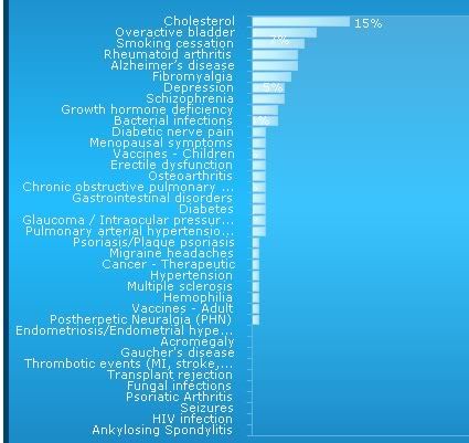
Incorrect Chart with too many items

Html code for the chart
            <telerik:RadChart ID="RadChart1" runat="server" Height="550px"
                SeriesOrientation="Horizontal" Width="900px" Skin="DeepBlue"
                IntelligentLabelsEnabled="True">
                <Appearance>
                    <FillStyle FillType="ComplexGradient">
                        <FillSettings>
                            <ComplexGradient>
                                <telerik:GradientElement Color="26, 120, 179" />
                                <telerik:GradientElement Color="35, 189, 254" Position="0.5" />
                                <telerik:GradientElement Color="26, 120, 179" Position="1" />
                            </ComplexGradient>
                        </FillSettings>
                    </FillStyle>
                    <Border Color="0, 66, 110" Width="5" />
                </Appearance>
 
                <Legend>
                    <Appearance Dimensions-Margins="1px, 2%, 12%, 1px"
                        Position-AlignedPosition="BottomLeft" Position-Auto="False" Position-X="5"
                        Position-Y="500">
                        <ItemAppearance>
                            <FillStyle FillType="Solid" MainColor="Transparent">
                            </FillStyle>
                        </ItemAppearance>
                        <ItemTextAppearance TextProperties-Color="White">
                        </ItemTextAppearance>
                        <FillStyle GammaCorrection="False" MainColor="Transparent">
                        </FillStyle>
                        <Border Color="76, 255, 255, 255" />
                    </Appearance>
                    <TextBlock Visible="True">
                        <Appearance Position-AlignedPosition="BottomLeft"
                            TextProperties-Color="LightSkyBlue">
                            <FillStyle MainColor="Transparent" FillType="Solid">
                            </FillStyle>
                        </Appearance>
                    </TextBlock>
                </Legend>
                <PlotArea>
                    <EmptySeriesMessage Visible="True">
                        <Appearance Visible="True">
                        </Appearance>
                        <TextBlock Visible="true" Text="No Therapeutic Areas Discussed">
                        </TextBlock>
                    </EmptySeriesMessage>
                    <XAxis>
                        <Appearance Color="98, 183, 226" MajorTick-Color="98, 183, 226">
                            <MajorGridLines Color="98, 183, 226" Width="0" />
                            <TextAppearance TextProperties-Color="White">
                            </TextAppearance>
                        </Appearance>
                        <AxisLabel>
                            <Appearance Position-Auto="false" Position-X="750"
                                Position-Y="605" Dimensions-Paddings="1px, 1px, 10%, 1px"
                                RotationAngle="270">
                            </Appearance>
                            <TextBlock Text="Percentage of Surveys" Visible="true">
                                <Appearance TextProperties-Color="LightSkyBlue">
                                </Appearance>
                            </TextBlock>
                        </AxisLabel>
                    </XAxis>
                    <YAxis AutoScale="False" MaxItemsCount="10" MaxValue="100" MinValue="0"
                        Step="10" Visible="False">
                        <Appearance Color="98, 183, 226" MajorTick-Color="98, 183, 226"
                            MinorTick-Color="98, 183, 226">
                            <MajorGridLines Color="120, 209, 248" />
                            <MinorGridLines Color="120, 209, 248" Width="0" />
                            <LabelAppearance Dimensions-AutoSize="False" Dimensions-Height="0px" Position-AlignedPosition="Right"
                                Dimensions-Width="0px">
                            </LabelAppearance>
                            <TextAppearance TextProperties-Color="White">
                            </TextAppearance>
                        </Appearance>
                        <AxisLabel Visible="True">
                            <Appearance Visible="True" RotationAngle="0">
                            </Appearance>
                            <TextBlock>
                                <Appearance TextProperties-Color="LightSkyBlue" Dimensions-AutoSize="False"
                                    Dimensions-Height="16px" Dimensions-Width="160px" AutoTextWrap="False">
                                </Appearance>
                            </TextBlock>
                        </AxisLabel>
                        <Items>
                            <telerik:ChartAxisItem>
                            </telerik:ChartAxisItem>
                            <telerik:ChartAxisItem Value="10">
                            </telerik:ChartAxisItem>
                            <telerik:ChartAxisItem Value="20">
                            </telerik:ChartAxisItem>
                            <telerik:ChartAxisItem Value="30">
                            </telerik:ChartAxisItem>
                            <telerik:ChartAxisItem Value="40">
                            </telerik:ChartAxisItem>
                            <telerik:ChartAxisItem Value="50">
                            </telerik:ChartAxisItem>
                            <telerik:ChartAxisItem Value="60">
                            </telerik:ChartAxisItem>
                            <telerik:ChartAxisItem Value="70">
                            </telerik:ChartAxisItem>
                            <telerik:ChartAxisItem Value="80">
                            </telerik:ChartAxisItem>
                            <telerik:ChartAxisItem Value="90">
                            </telerik:ChartAxisItem>
                            <telerik:ChartAxisItem Value="100">
                            </telerik:ChartAxisItem>
                        </Items>
                    </YAxis>
 
<YAxis2>
<AxisLabel>
<Appearance RotationAngle="0"></Appearance>
</AxisLabel>
</YAxis2>
 
                    <Appearance Dimensions-Margins="19%, 90px, 12%, 25%"
                        Corners="Rectangle, Rectangle, Rectangle, Rectangle, 5"
                        Position-Auto="False" Position-X="225" Position-Y="104.5">
                        <FillStyle MainColor="50, 255, 255, 255" SecondColor="Transparent">
                        </FillStyle>
                        <Border Color="97, 180, 223" />
                    </Appearance>
                </PlotArea>
                <ChartTitle>
                    <Appearance Dimensions-Margins="4%, 10px, 14px, 6%">
                        <FillStyle MainColor="">
                        </FillStyle>
                    </Appearance>
                    <TextBlock Text="">
                        <Appearance TextProperties-Color="White" TextProperties-Font="Verdana, 14pt">
                        </Appearance>
                    </TextBlock>
                </ChartTitle>
            </telerik:RadChart>


C# code to build the chart from a sqldatareader
string strNValue = Convert.ToString(prmNValue.Value);
SqlDataReader dr = cmd.ExecuteReader();
 
RadChart1.PlotArea.XAxis.DataLabelsColumn = "TherapArea";
 
RadChart1.DataSource = dr;
RadChart1.DataBind();
 
RadChart1.Visible = true;
 
RadChart1.PlotArea.YAxis.AxisLabel.Visible = true;
RadChart1.PlotArea.XAxis.AxisLabel.Visible = true;
RadChart1.PlotArea.YAxis.AxisLabel.TextBlock.Text = "Percentage of Surveys";
 
string strLegend = strManufacturer + " (n=" + strNValue + ")";
RadChart1.Legend.TextBlock.Text = strLegend;
 
RadChart1.Series[0].DefaultLabelValue = "#Y%";
 
dr.Close();

5 Answers, 1 is accepted

Sort by
0
Evgenia
Telerik team
answered on 26 Apr 2011, 01:30 PM
Hello Michael,

For charts that have many data points or data points with values too close to one another, labels tend to collide making readability a problem. Our Intelligent Labels feature of RadChart automatically re-aligns labels making each labeled value stand out clearly.
You can simply turn on this feature by setting the RadChart's IntelligentLabelsEnabled property to "true".

Kind regards,
Evgenia
the Telerik team

Browse the vast support resources we have to jump start your development with RadControls for ASP.NET AJAX. See how to integrate our AJAX controls seamlessly in SharePoint 2007/2010 visiting our common SharePoint portal.

0
Jim
Top achievements
Rank 1
answered on 28 Apr 2011, 07:51 PM
That didn't work, same results as setting it to false.
0
Evgenia
Telerik team
answered on 04 May 2011, 08:33 AM
Hi Michael,

Try to reduce the FontSize of the Series Items Labels so that they will automatically position according to their corresponding Bar like this:
<telerik:RadChart ID="RadChart1" runat="server">
             <Series>
                 <telerik:ChartSeries Name="Series 1">
                     <Appearance>
                         <TextAppearance TextProperties-Font="Verdana, 6pt">
                         </TextAppearance>
                     </Appearance>
                 </telerik:ChartSeries>
             </Series>
         </telerik:RadChart>

Also as another suggestion - why don't you hide the Labels of the Bars and show them on the Axis? This way the Chart will become more readable. Let me know if you need help achieving this.

Regards,
Evgenia
the Telerik team

Browse the vast support resources we have to jump start your development with RadControls for ASP.NET AJAX. See how to integrate our AJAX controls seamlessly in SharePoint 2007/2010 visiting our common SharePoint portal.

0
Jim
Top achievements
Rank 1
answered on 04 May 2011, 03:26 PM
Because I'm creating the graph programatically, it seems that the font size is read only and ignores any setting I have for the series. Thanks for the suggestions though.
0
Evgenia
Telerik team
answered on 09 May 2011, 08:44 AM
Hi Michael,

The problem is not in the way you create the Chart (declaratively or programmatically) but that you are using a Skin different than the Default one. To be able to change some of the predefined appearance properties when some Skin different than the Default one is set - you should turn off the SkinsOverrideStyles property of the Chart. This way your changes will take effect.

Regards,
Evgenia
the Telerik team

Browse the vast support resources we have to jump start your development with RadControls for ASP.NET AJAX. See how to integrate our AJAX controls seamlessly in SharePoint 2007/2010 visiting our common SharePoint portal.

Tags
Chart (Obsolete)
Asked by
Jim
Top achievements
Rank 1
Answers by
Evgenia
Telerik team
Jim
Top achievements
Rank 1
Share this question
or