
Validation support in RadControls for Silverlight
One of the new data enhancements introduced in Silverlight 3 is the rich validation support. I am proud to announce that with our Service Pack release that is coming soon, RadControls for Silverlight will support all validation utilities introduced in Silverlight 3. Controls that benefit from the validation support in our Q2 Service Pack release are:
RadDatePicker
RadNumericUpDown
RadSlider
RadMaskedTextBox
RadTreeView
The binding engine can catch exceptions that occur while updating a value if either the setter function of the source object throws an exception, or the associated type converter. For example the following setter function will throw an exception that will be handled by the binding engine. The exception will be throw if the value of age is less than 18, note that the exception generated in the setter or type converter will be silently handled by the binding engine by default.
To take advantage of the validation you should use properties ValidatesOnExceptions and NotifyOnValidationError that are part of the BindingExpression. These properties described the behavior of the control when a validation error occurs. If you set the ValidatesOnExceptions to true, the control will invoke a visual state that will show a tooltip with a notification of the exception being generated:

Each of the controls above has three new states part of its control template that are used to control the validation behavior: Valid, InvalidUnfocused, and InvalidFocused. You can change these visual states to achieve custom validation logic. Moreover, Microsoft has included a new ValidationSummary control. If you want to have your error in the validation summary control as well, you should set the NotifyOnValidationError=true. This will also invoke the BindingValidationError event of your control.
RadTimePicker
RadDatePicker
RadNumericUpDown
RadSlider
RadMaskedTextBox
RadTreeView
The binding engine can catch exceptions that occur while updating a value if either the setter function of the source object throws an exception, or the associated type converter. For example the following setter function will throw an exception that will be handled by the binding engine. The exception will be throw if the value of age is less than 18, note that the exception generated in the setter or type converter will be silently handled by the binding engine by default.
| private int ageVal; |
| public int Age |
| { |
| set |
| { |
| if (ageVal != value) |
| { |
| ageVal = value; |
| this.OnPropertyChanged("Age"); |
| if (ageVal < 18) |
| { |
| throw new Exception("Age must be at least 18."); |
| } |
| } |
| } |
| get |
| { |
| return ageVal; |
| } |
| } |
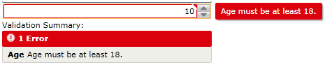
To take advantage of the validation you should use properties ValidatesOnExceptions and NotifyOnValidationError that are part of the BindingExpression. These properties described the behavior of the control when a validation error occurs. If you set the ValidatesOnExceptions to true, the control will invoke a visual state that will show a tooltip with a notification of the exception being generated:
|
Each of the controls above has three new states part of its control template that are used to control the validation behavior: Valid, InvalidUnfocused, and InvalidFocused. You can change these visual states to achieve custom validation logic. Moreover, Microsoft has included a new ValidationSummary control. If you want to have your error in the validation summary control as well, you should set the NotifyOnValidationError=true. This will also invoke the BindingValidationError event of your control.
| <StackPanel> |
| <telerikInput:RadNumericUpDown x:Name="numeric" Maximum="30" Value="{Binding Age,Mode=TwoWay,ValidatesOnExceptions=True,NotifyOnValidationError=True}" /> |
| <TextBlock Text="Validation Summary:"/> |
| <data:ValidationSummary /> |
| </StackPanel> |
In our service pack release you will be able to find validation examples for each control that has validation support.
Comments
Comments are disabled in preview mode.
All articles
Topics
Latest Stories
in Your Inbox
Subscribe to be the first to get our expert-written articles and tutorials for developers!
All fields are required