Gauges and AutoCompleteTextView Beta plus more in UI for iOS
The third major release of UI for iOS is already here, and as always it's packed and stacked with great features following your requests and feedback. The DataForm becomes official, and we introduce two brand new controls—Gauges and AutoCompleteTextView (Beta). The Chart also gets three highly requested features added—namely, the DateTime Categorical and the Logarithmic axis as well as Range Bar/Column chart type. Last, but not least, you will be happy to hear that we introduce support for Swift 2.0, while keeping our iOS7 support until Q1 2016 inclusive. Without further preamble, let’s take a deep dive into what’s new.
Limitless Styling Customizations
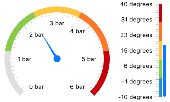
You can customize every aspect of the Gauges’ look and feel thanks to the carefully designed API. Starting from the needle, going through with the segments of the arc/line, and finishing with the ticks and labels, you can create a design that will match every application’s look and feel.
Animations
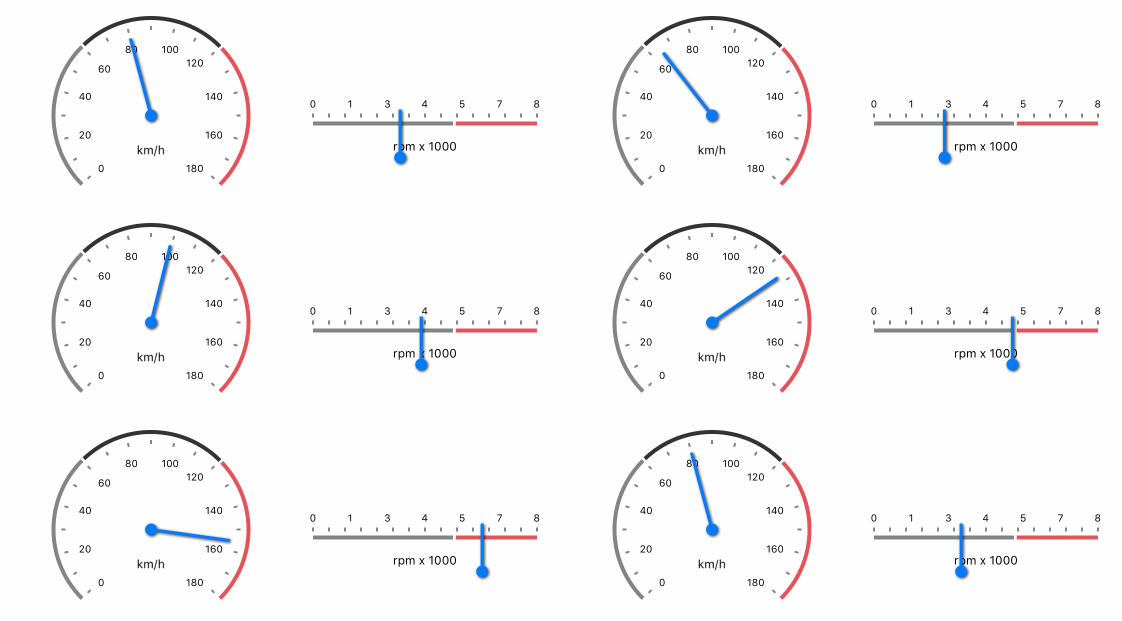
The Gauges API enables easy-to-use animations, allowing you to get a smooth transition effect when going from one value to another.
Interactions
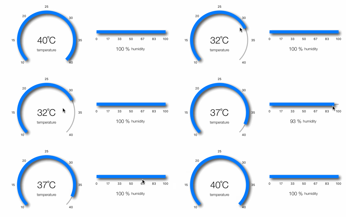
What would a gauge be if it’s only a static representation of the data and out of your control? With Gauges for iOS you can be in control of what the gauge’s value should be. Just swipe your finger on top of the linear or radial gauge to change the value, it’s that easy.
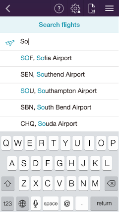
Filter by StartsWith or Contains
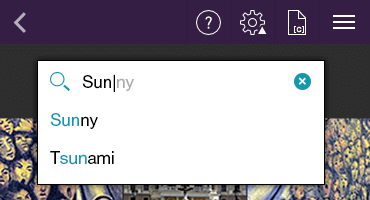
Depending on the scenario, you may want to give suggestions that starts with or contains the typed characters. With AutoCompleteTextView it’s a matter of a single property to control that behavior.
Tokens Support
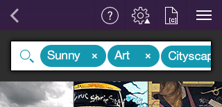
With AutoCompleteTextView you are allowed to search for and select several items in one control. These items appear as tokens that you can easily dismiss/deselect using their close button. The tokens also provide a convenient API for you to customize them like changing their style, adding an image, etc. The tokens are useful for selecting multiple items like tags or people.
Suggest, Append or Both
Depending on your preference, AutoCompleteTextView can only append the remainder of the suggested word without opening any popups with lists of items. Or, it can suggest you choose an item from the filtered list of items that appear. Last, but not least, it can append the remainder of the word and open a list of suggestions at the same time.
Null-Text and Close Button
Thank to the null-text support, the end-user can easily understand what is expected from him as input. With the Close button, the end-user can easily dismiss any selected items.

Different Layouts
We added support for different layouts for those of you who are not fans of the standard UITableView way of showing settings lists. Now you can:
These new layouts will also allow you to achieve one and the same look and feel of your app on iOS and Android, as the DataForm for Android supports the same layouts.
Collapsible Groups
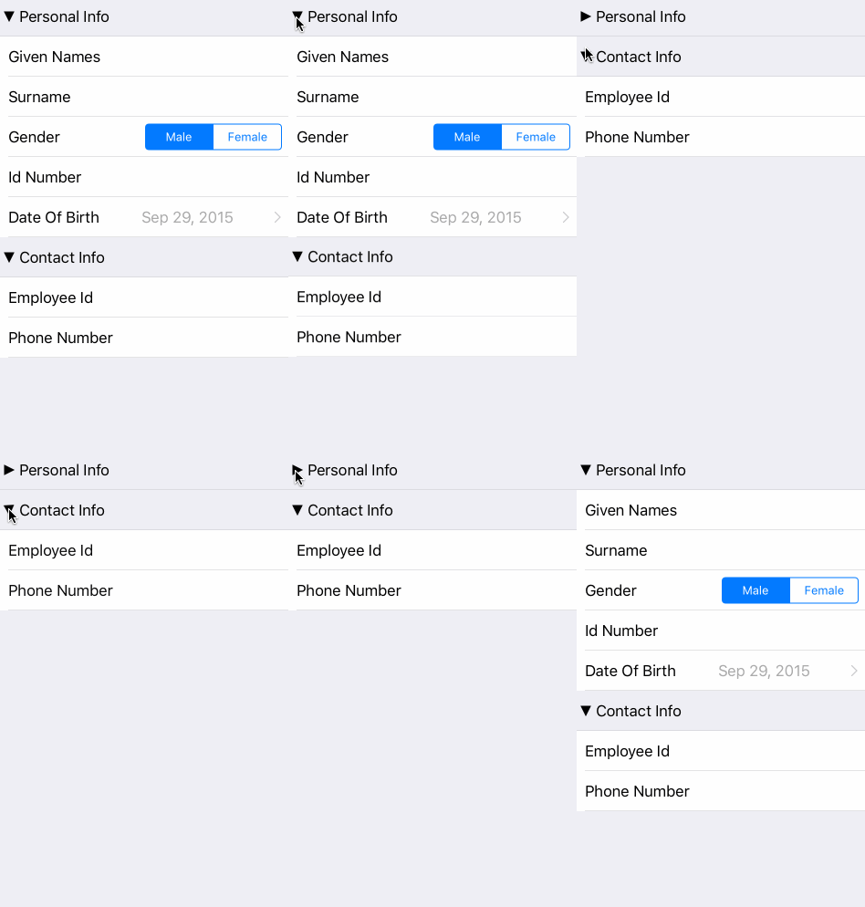
Sometimes, in long lists of properties the end-user can get lost. What can improve the end-user experience is groups. What can improve the end-user behavior even further is the ability to collapse and expand these groups. This way the end-user will be able to focus only on a few expanded groups, and avoid having a long long list of properties to scroll up and down.
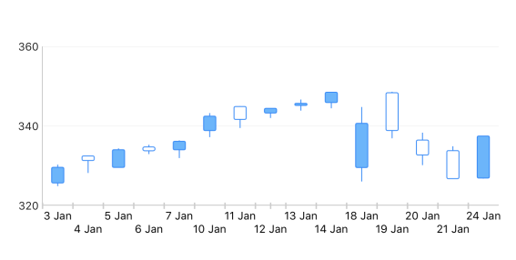
A common scenario for a financial chart is to have only the days Mon-Fri plotted on the axis (i.e. excluding the weekends). With the standard DateTime axis that we have, excluding the weekends was not possible. We got numerous requests for the feature in question though, so here it is—a DateTime Category axis where you have control over which dates should be plotted and which not. Here is the result from excluding the weekends from the chart:
Logarithmic Axis
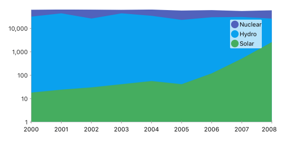
Some values are just not like the others—they are much bigger or much smaller, forming a logarithmic function if one decides to put them all on the same coordinate system. For such cases, the Logarithmic axis are here to help. Thanks to it, you can display values of different scale on one and the same chart without ‘shrinking’ some of the values in favor of others.
Range Bar/Column Chart
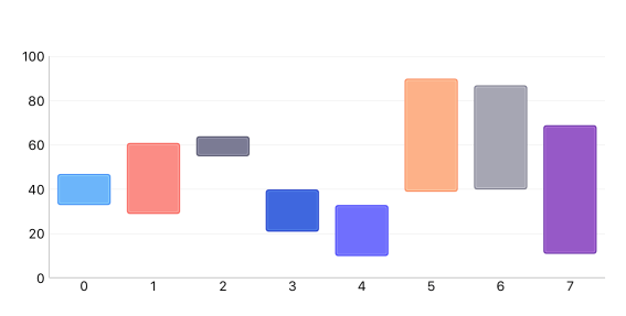
This new chart type is useful for a number of scenarios that require a data-point consisting of two values—a minimum and a maximum. This could be the minimum/maximum temperature for a day, the speed of the WiFi, etc.
These and more features and fixes are available in the latest Q3 2015 version of UI for iOS. Get it now [Trial|Paid]. Check the full list of Release Notes here.
Happy coding!
Gauges
The Linear and Radial Gauges for iOS are a great way to illustrate the magnitude of a value in a given range of upper and lower bounds. This could be speed, distance, temperature, progress of a process, matter saturation or other everyday-life and industrial values. Here are the features you can find in the component:
Limitless Styling Customizations
You can customize every aspect of the Gauges’ look and feel thanks to the carefully designed API. Starting from the needle, going through with the segments of the arc/line, and finishing with the ticks and labels, you can create a design that will match every application’s look and feel.
Animations
The Gauges API enables easy-to-use animations, allowing you to get a smooth transition effect when going from one value to another.

Interactions
What would a gauge be if it’s only a static representation of the data and out of your control? With Gauges for iOS you can be in control of what the gauge’s value should be. Just swipe your finger on top of the linear or radial gauge to change the value, it’s that easy.

AutoCompleteTextView (Beta)
Typing can be a tedious operation, especially on a mobile device. With AutoCompleteTextView you can save the end-users time and effort by giving them suggestions to choose from, based just on the characters they already typed. This is useful in various situations—where the end-user has to choose from a list of airports, or a list of known recipients. On top of that AutoCompleteTextView allows for choosing not just one, but several items. These items become the so-called token and enable scenarios like sending a message to multiple recipients.
Filter by StartsWith or Contains
Depending on the scenario, you may want to give suggestions that starts with or contains the typed characters. With AutoCompleteTextView it’s a matter of a single property to control that behavior.

Tokens Support
With AutoCompleteTextView you are allowed to search for and select several items in one control. These items appear as tokens that you can easily dismiss/deselect using their close button. The tokens also provide a convenient API for you to customize them like changing their style, adding an image, etc. The tokens are useful for selecting multiple items like tags or people.

Suggest, Append or Both
Depending on your preference, AutoCompleteTextView can only append the remainder of the suggested word without opening any popups with lists of items. Or, it can suggest you choose an item from the filtered list of items that appear. Last, but not least, it can append the remainder of the word and open a list of suggestions at the same time.
Null-Text and Close Button
Thank to the null-text support, the end-user can easily understand what is expected from him as input. With the Close button, the end-user can easily dismiss any selected items.

DataForm - It’s Official!
The DataForm is now official and stable and you are free to use it in your AppStore apps. In addition to the stability and the numerous fixes, what’s new there?Different Layouts
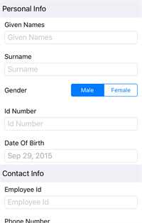
We added support for different layouts for those of you who are not fans of the standard UITableView way of showing settings lists. Now you can:
- Place the properties labels above the editors
- Place the properties labels on the left of the editors, visually detaching these labels from the editors themselves
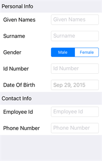
- Set the properties labels inline
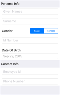
These new layouts will also allow you to achieve one and the same look and feel of your app on iOS and Android, as the DataForm for Android supports the same layouts.
Collapsible Groups
Sometimes, in long lists of properties the end-user can get lost. What can improve the end-user experience is groups. What can improve the end-user behavior even further is the ability to collapse and expand these groups. This way the end-user will be able to focus only on a few expanded groups, and avoid having a long long list of properties to scroll up and down.

Chart
DateTime Category AxisA common scenario for a financial chart is to have only the days Mon-Fri plotted on the axis (i.e. excluding the weekends). With the standard DateTime axis that we have, excluding the weekends was not possible. We got numerous requests for the feature in question though, so here it is—a DateTime Category axis where you have control over which dates should be plotted and which not. Here is the result from excluding the weekends from the chart:

Logarithmic Axis
Some values are just not like the others—they are much bigger or much smaller, forming a logarithmic function if one decides to put them all on the same coordinate system. For such cases, the Logarithmic axis are here to help. Thanks to it, you can display values of different scale on one and the same chart without ‘shrinking’ some of the values in favor of others.

Range Bar/Column Chart
This new chart type is useful for a number of scenarios that require a data-point consisting of two values—a minimum and a maximum. This could be the minimum/maximum temperature for a day, the speed of the WiFi, etc.

Swift 2.0 Support in Xcode 7
Although according to TIOBE Swift is still behind Objective-C, Swift is undoubtedly the trending leader already when it comes to iOS development. Apple is betting much on it and you barely can find any new content in Objective-C. With Swift 2.0. which came with Xcode 7, there were some breaking changes in the language which required us to make some changes in our code base as well. The improvements are already in place and you will be happy to find that UI for iOS works flawlessly in Swift 2.0 and Xcode 7.iOS7 Support
iOS9 is now official and deployed to the end-users' devices. This next version of iOS raised a question for the UI for iOS suite though. Should we still support the iOS version we started with some time ago—iOS7. During the summer there was an open survey at our site that asked: “Which is the minimum required iOS version that you plan to support as iOS 9 becomes official. From more than 1000 respondents 34% replied that they will still bet on iOS7 as the minimum supported version. Therefore, despite the fact that globally there are only 8% left using iOS7 and previous versions, we will continue shipping an iOS7-compatible product. The last major version (and its minor updates thereafter) to support iOS7 will be Q1 2016.These and more features and fixes are available in the latest Q3 2015 version of UI for iOS. Get it now [Trial|Paid]. Check the full list of Release Notes here.
Happy coding!
Autocomplete, Chart, Form, Gauge, iOS

About the Author
Nikolay Diyanov
Nikolay Diyanov Diyanov is the Product Manager of the Native Mobile UI division at Progress. Delivering outstanding solutions that make developers' lives easier is his passion and the biggest reward in his work. In his spare time, Nikolay enjoys travelling around the world, hiking, sun-bathing and kite-surfing.
Find him on Twitter @n_diyanov or on LinkedIn.
Comments
Comments are disabled in preview mode.
