Fast Track Your Mobile Development Project

banner image courtesy of SuperCar-RoadTrip.fr
This is the first part of series of blog posts on how to Fast track your mobile development project. In the next post we’ll explore the fast track to Hybrid Application Development and finally Native Application Development.
Many development teams have large investments in desktop apps that have provided long-lasting profitability and stability for years; however, the industry is changing and now it’s time to retool for mobile and reinvest. The path from desktop to mobile development isn’t necessarily straightforward; in fact, it can be quite a daunting prospect. Finding a strategy that’s right for your team is all about knowing your options, understanding your team and knowing the challenges ahead. This three-part series will look at the technology landscape for mobile development. We’ll make sense of each technology path and learn how to make decisions that can fast track the move to mobile.
There’s No Easy Route

image courtesy of Tauno Tõhk
The first step to finding a solution is accepting that there is no easy route. Each team has its own set of specialized skills, and no two apps are created equal. Because of the diversity in skills and tools, there’s no one boilerplate strategy for getting your app from the desktop to mobile. The best practice is to assess the current skills and technologies you’re using and match them with a mobile technology that works best for the team. Additionally, you may find more than one approach is needed to meet your business requirements.
Web
If you have a web application, technically it’s a mobile application already. Since most devices have a web browser they are capable of opening your application. The catch is if the was designed for desktop use, the mobile user experience is probably poor. Responsive design is a possible candidate for going mobile, because the technical requirements, such as tooling and team skills, align well.
Responsive

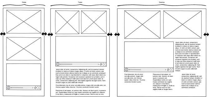
Responsive web design (RWD) is the practice of using a fluid layout, media queries and flexible images to produce a web application that can respond to the client's screen size. Early on, RWD was called a fad, but over the years has solidified its position as a viable option for mobile development.
Multiple frameworks have become synonymous with RWD and helped pave the way for the mobile web. These frameworks include Bootstrap (formerly Twitter Bootstrap), Foundation and Telerik RadPageLayout. Because of their overall popularity, UI components such as Kendo UI widgets, Telerik UI for ASP.NET MVC and Telerik UI for ASP.NET AJAX work seamlessly with responsive frameworks. While RWD serves as the basic UI infrastructure for building mobile web applications, additional advanced techniques such as Adaptive design and Responsive Design and Server Side Components (RESS) also accompany RWD.
Telerik UIs

Telerik UIs include everything for building web and mobile apps featuring over 70 controls with solutions for navigation, charting and content creation. Telerik UIs are tailored for projects using any web stack, including HTML & JavaScript, ASP.NET MVC, PHP, JSP, and ASP.NET AJAX. All of the controls utilize responsive, adaptive and/or RESS techniques to work on any screen size.
Adaptive
Adaptive design, also know as progressive enhancement, uses feature detection, the process of detecting a device’s feature set and improving the user experience based on the availability of those features. These features often include screen size, bandwidth, gps, camera and others detected in the browser. Once a feature is known to exist, the application can then transform the UI for better viewing using RWD, or serve low-bandwidth resources to a user with limited connection speeds.
Complex UI components such as those found in Kendo UI framework often use adaptive techniques to achieve optimal results. Some adaptive design approaches even include server-side processing to deliver device-specific content.
RESS
While RWD is typically client side in nature, techniques for involving the server are referred to as RESS. RESS leverages the server to help detect, modify and/or enhance the application. RESS can be a powerful utility when used along side RWD and adaptive design, and fits especially well with ASP.NET web forms when using UI for ASP.NET AJAX. RESS can also come in the form of web services such as the Responsive Images service included with the Telerik Backend Services.
Retrofitting Exiting Web Apps
Existing web apps can be updated with RWD techniques to begin a transition to mobile. The challenges with retrofitting a web app depend greatly on factors such as UI complexity and how close the existing code base aligns with modern HTML best practices.
Existing apps with complex data entry form and modal windows require heavy use of a mouse or wide screen real estate and may not be transition well. Apps developed with techniques considered “modern” best practices such as using semantic elements and CSS instead of tables, or those designed using fixed-grid systems may be ideal for retrofit. It’s important to consider user experience (UX) matters, and what works for desktop may not translate well to mobile.
Responsive Web Considerations
Responsive web design can work on any screen size from a single code base, making it easy to maintain. RWD has the ability to use existing web infrastructure, tools and developer skills.
App Store or Bust

Because RWD is web-based, you are limited to current browser capabilities. There’s limited or no support for on device hardware such as camera, gyroscope and other sensors. Push notifications are also off limits without an app installed on the user’s device. In addition, there is no direct path to deploying your app in the app stores. To take your app from the web to the store will require additional development, essentially creating a hybrid app.
Responsive Web Fast Track
The following resources can help your team get up to speed:
- The Anatomy of Responsive ASP.NET Apps (free whitepaper)
- Kendo UI Responsive Demo
- Responsive Images – There’s a Service for That!
- Server-side Responsive Design with ASP.NET MVC and Interchange
- Optimizing Responsive Design Using RESS with ASP.Net Web Forms
tl;dr
- Responsive web design (RWD) uses web technologies to develop for any screen size
- Adaptive design uses feature detection for optimization and better user experience
- Responsive Design with Server Side components (RESS) includes server technology for further optimization
- Kendo UI framework, Telerik UI for ASP.NET MVC or Telerik UI for ASP.NET AJAX can be used for RWD
- Retrofitting an existing web app with RWD can be difficult, dependant on many factors and may not be a possibility for all apps
- RWD is has limited access to on device hardware & no push notifications
- If the app store is a high priority, RWD may pose a challenge
This is the first part of series of blog posts on how to Fast track your mobile development project. In the next post we’ll explore the fast track to Hybrid Application Development and finally Native Application Development.

Ed Charbeneau
Ed
