Progress Telerik UI for ASP.NET MVC
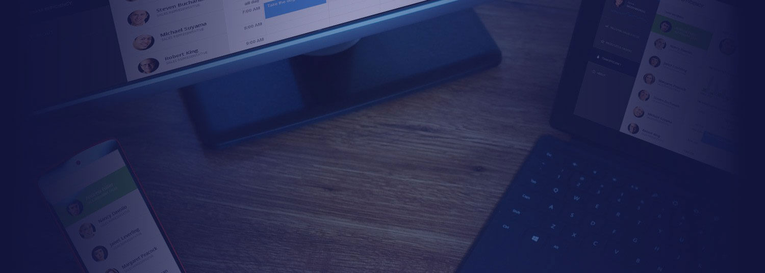
Mobile-Optimized ASP.NET MVC Apps
With Minimum Effort
Out-of-the-box responsive UI helps you deliver apps
tailored to user’s screen size in no time
The Importance of Being Responsive

Content is like water:
“ You put a water into a cup, it becomes the cup.
You put water into a bottle, it becomes the bottle,
You put it in a teapot, it becomes the teapot.”
-Bruce Lee
Responsive web design is the fastest way to serve desktop and mobile web users in a tailored and cost-effective manner. The responsive approach suggests you a focus on modifying the layout and display of desktop websites to adapt to the smaller screen size and touch-input of mobile devices.
The advantages are many: you can use your existing skill set while delivering content that scales to different form factors in a user-friendly manner, with one code base, one set of URLs and one design language.
Recognizing the need for developers to build apps tailored to any screen size quickly, we have been hard at work to make our ASP.NET MVC controls do most of the work for you. Here’s how.
Save Time on Responsive Projects
UI for ASP.NET MVC saves you time and effort when implementing responsive design practices since the controls take care of them out-of-the-box or with the change of a single property:
- All components render larger clickable areas on small screens and scale proportionately to the container in which they’ve been placed
- All components integrate well with grid-layout frameworks, such as Bootstrap and Zurb Foundation
- The complex and popular components, such as Grid and Scheduler, serve different renderings on small screens to provide an optimal user experience
Integration with Bootstrap

Bootstrap is the most widely adopted framework for building responsive web projects. It provides a grid-layout framework, as well as dozens of custom HTML and CSS components.
Telerik ASP.NET MVC components feature extensive integration with Bootstrap. Not only do all controls scale proportionately to the framework containers on different screen sizes, but they also come with a Bootstrap theme developed specifically with design and dimensions similar to the Bootstrap components. This enables you to achieve a consistent look and feel when using the two toolsets in applications side-by-side. In addition, we’ll release a tool this January enabling you to convert any Bootstrap theme on the web to a Telerik theme with just a few clicks.
Check out the NorthWind Dashboard sample application for a showcase of the integration between Telerik components and Bootstrap.
Mobile-Optimized Rendering for Complex Controls
We’ve optimized the rendering of the most complex UI components, such as Grid and Scheduler, for use on small screen sizes.
Grid
The Grid’s amazing advantage is its two types of rendering – one for desktop and one for mobile devices. To facilitate data operations on small screen sizes, the mobile rendering moves the behavior of editing, filtering, sorting and column operations to different views to provide users with a mobile native-like look and feel. Selection, column reordering and column resizing also happen in a more mobile-friendly way.
In addition, the Grid enables you to hide specific columns on mobile devices to help users monitor only what’s important.
Just like all other components in the suite, the Grid is responsive, which means it rearranges its elements for optimal presentation on the screen real estate and scales proportionately to the container in which it’s been placed.

Scheduler
Just like the Grid, the Scheduler features a mobile-optimized rendering presenting the appointment editing functionality in a separate view for more user-friendly manipulation. On smaller screens its navigation turns from a tabstrip into a dropdown and its elements rearrange for optimal presentation. The selection and appointment resizing also happen in a more mobile-friendly way.

Responsive Panel
The Responsive Panel is a container control enabling you to hide content on small screens behind a “hamburger” menu, thus optimizing the space your content takes in the viewable area on limited view ports. It comes especially useful in responsive navigation scenarios.
Responsive Panel demo
Responsive Demos


Northwind Dashboard
Learn how to use Telerik controls with Bootstrap to provide UX tailored to the user's screen size.


Responsive Demos
Test how the Telerik ASP.NET MVC extensions adjust to changing view ports in these responsive demos.