
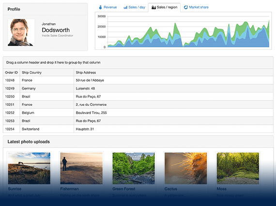
UI for ASP.NET MVC
ASP.NET MVC DatePicker
- Effortlessly select single or multiple dates from a calendar with the Telerik UI for ASP.NET MVC DatePicker component. Utilize its multiple built-in features, such as globalization, localization, keyboard navigation, RTL support and more.
- Part of the Telerik UI for ASP.NET MVC library along with 110+ professionally designed UI components.
- Includes support, documentation, demos, virtual classrooms and more!
-
Overview
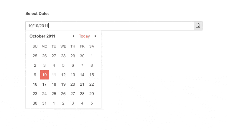
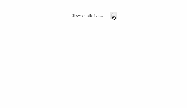
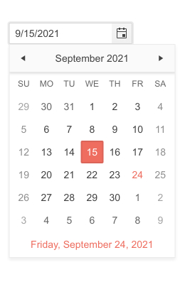
The ASP.NET MVC DatePicker lets end-users select single or multiple dates from a calendar. The control can be utilized in several app scenarios from booking appointments to checking bank statements for a certain date. You can customize it by adding templates, enabling/disabling dates and adding a week number column. It is adapted for all users with outstanding support for keyboard navigation, localization, globalization, accessibility and RTL.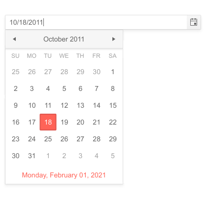
-
Component Types
The Telerik UI for ASP.NET MVC DatePicker features two renderings:- Modern – with sleek UI suitable for the newest applications
- Classic – with traditional UI for more authentic applications
-
Floating Label
Saving space without losing the context of the form field is a piece of cake with the floating label feature in the DatePicker component. Add a label that moves above the input upon clicking to create a smoother and more efficient user experience.
-
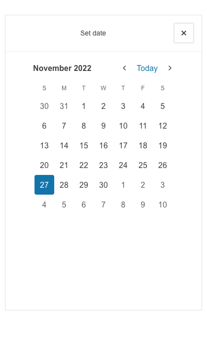
Adaptive Mode
Enable a mobile-friendly rendering of the DatePicker popup by setting the AdaptiveMode parameter to AdaptiveMode.Auto. The picker component automatically adapts to the current screen size and changes its rendering accordingly. In auto adaptive mode, the DatePicker component also allows you to define the title text rendered in the header of the popup.
See the Telerik UI for MVC DatePicker adaptive rendering demo
-
Templates
The component has three template options – Month View Template, Footer Template and Week Column Template. The first one renders icons for specific days, for example it can render a cake icon on birthdays or a briefcase icon on days with important meetings. The second template allows rendering of custom content in the DatePicker footer and the third renders a Week column in the left side of the component.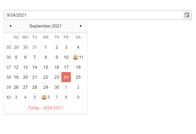
-
Range Selection
There are a couple of ways a user can choose a range of dates. One option would be to use the Telerik UI for ASP.NET MVC DateRangePicker, however, you can also provide two separate Date Pickers and allow users to specify the Start and End date of a certain event.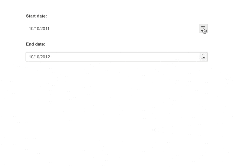
-
Date and Time Picker
In case your project requires a component that can be more time specific, such as setting dentist appointments or booking a session with a tutor, you can implement the Telerik UI for ASP.NET MVC DateTimePicker and specify the exact date and time using a single component.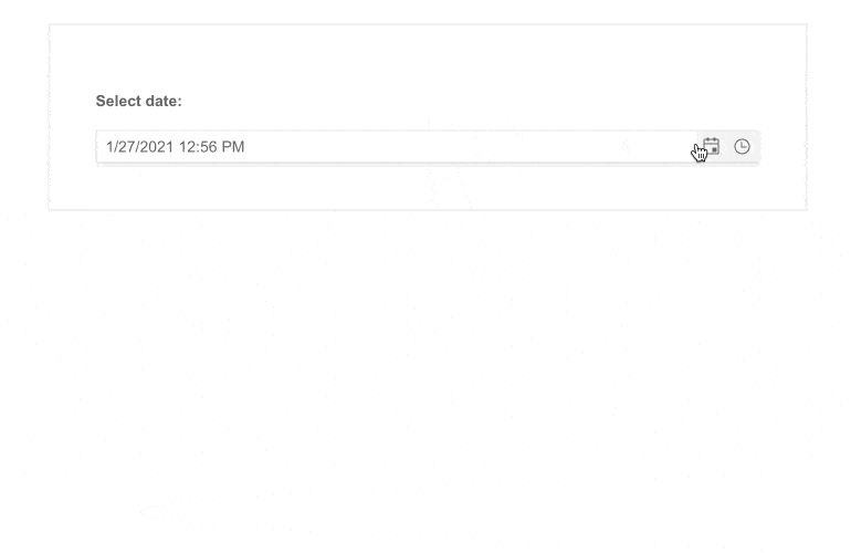
-
Customization of DateInput Messages
It is now possible to conveniently personalize the message placeholder for the date input in the Date & Time Picker elements by utilizing the Messages feature located in the DateInput UI component. Additionally, the component offers the .Format() functionality which allows the user to specify the date format for parsing and formatting the machine date.
-
Start View and Selection Depth
The control lets you set its initial view, choosing from Month, Year, Decade and Century. The MVC DatePicker also allows you to define the navigation depth of the views. -
Selected Dates
The ASP.NET MVC DatePicker allows the rendering of pre-selected dates and lets you define the minimum or maximum number of dates displayed.
Learn more in our documentation -
Disable Dates
In many cases not all dates are open for booking an appointment, that is why we have added the DisableDates function. This allows you to disable weekends, holidays or any other day of the month that is not acceptable to you.
-
Calendar Types
The DatePicker component supports only the Gregorian calendar, however it is possible to display the Gregorian date with the Lunar year by setting the Value of the component to a past date or specifying the Min option to a date within the valid range. -
Events
The DatePicker offers fires various events - including set/get a value, open/close the calendar or configure its states. For a full list of events fired by the ASP.NET MVC DatePicker visit our documentation.
-
Globalization
The Telerik UI for ASP.NET MVC DatePicker is adapted to respond to different cultures’ time and date formats and month and weekday names. The component supports Globalization, and you can define its culture using the kendo.culute() method.
Check out the ASP.NET MVC DatePicker Globalization demo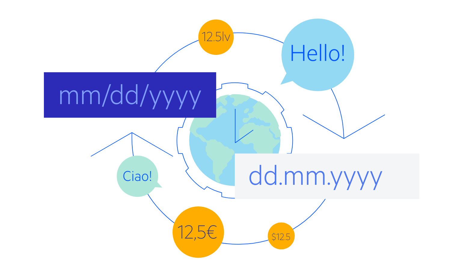
-
RTL Support
The ASP.NET MVC DatePicker features RTL support. The RTL functionality is present in most of our ASP.NET MVC components to respond to users who communicate through a right-to-left language such as Arabic or Hebrew.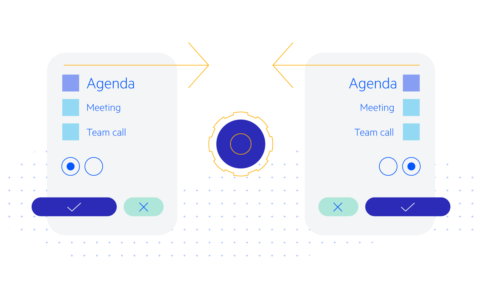
-
Accessibility
Thanks to the Telerik UI for ASP.NET MVC DatePicker component being Section 508 and WCAG 2.1 guidelines compliant, you can rest assured all user’s need will be accommodated.
-
Keyboard Navigation
The ASP.NET MVC DatePicker allows users to open/close the popup and select/deselect dates by using the arrows or a combination of ctrl and arrows to navigate the months of the year. For a full list of supported keys and user actions visit the DatePicker Keyboard Navigation demo.
-
DatePicker Theming
The DatePicker is one of the many ASP.NET MVC components you can style using one of multiple built-in themes and swatches. You can easily customize any of out-of-the-box themes with a few lines of CSS, or create new themes to match your colors and branding by using the Progress SASS ThemeBuilder application.
