
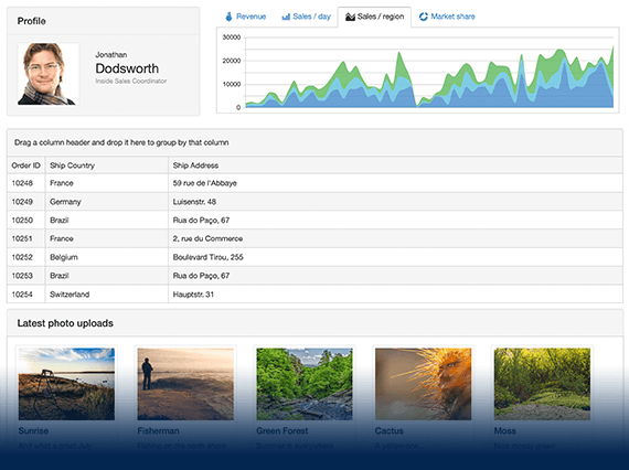
UI for ASP.NET MVC
ASP.NET MVC ComboBox
- The ASP.NET MVC ComboBox offers your users a choice between a list of pre-set options or lets them enter their own. Supporting local and remote data binding, item templates, keyboard navigation and more.
- Part of the Telerik UI for ASP.NET MVC library along with 110+ professionally designed UI components.
- Includes support, documentation, demos, virtual classrooms and more!
-
Overview
The Telerik UI for ASP.NET MVC ComboBox control enables filtering and selecting from a list of predefined values, as well as option to values to an existing list. A richer version of the standard HTML select, MVC ComboBox supports local and remote data binding, filtering, item templates, virtualization for performance boosts, and configurable options for controlling the list behavior.
See the Telerik UI for ASP.NET MVC ComboBox in action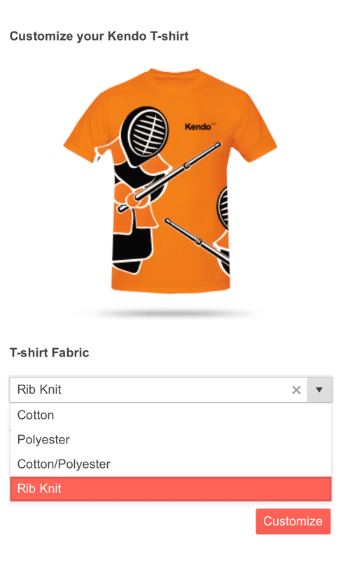
-
Data Binding
The ComboBox UI component provides extensive flexibility when it comes to data binding. You can choose between AJAX, server, local, remote and even custom binding.
To learn more about them and see how it’s done visit the documentation.

-
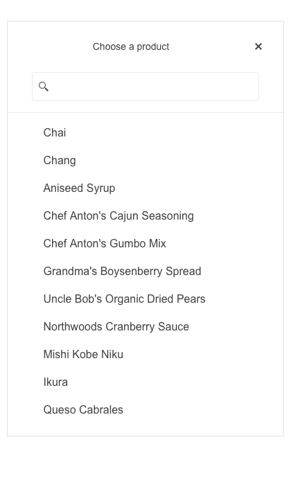
Server and Client Filtering
Take advantage of the server and client-side filtering of the ComboBox component. You can either filter the control to display only items “starting with” or “containing” a certain text.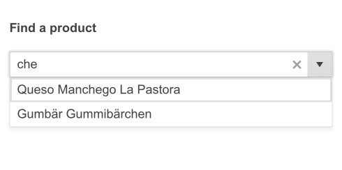
-
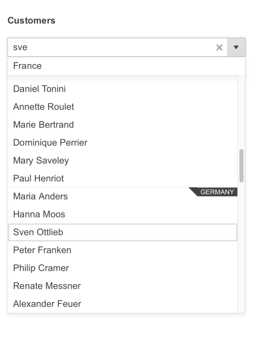
Grouping
The built-in grouping functionality of the ComboBox makes it easier for users to navigate the list and find the items they want to choose quickly. For example, you can group cities by countries or items by categories.
-
Templates
Using templates grants you full control over the appearance of items, values and pop-up headers in the ComboBox. You can also customize the templates to fit your project’s needs. The ComboBox component provides four templating options:- Item Template manages how list items are rendered.
- Header Template defines how the popup header is displayed.
- Footer Template manages the way the popup footer is rendered.
- No-Data Template displays no templates in the popup.
Learn more about all ASP.NET MVC ComboBox Templating options in our documentation
-
Cascading ComboBox
Cascading ComboBox lets you guide your users’ journey by enabling related lists of items to cascade from one another. For example, it can be used to let users choose their Country, then browse regions within the country to find the desired one, which will filter the last ComboBox to show only cities within that region and allow users to select their preferred one.
Check out the ASP.NET MVC Cascading ComboBox demo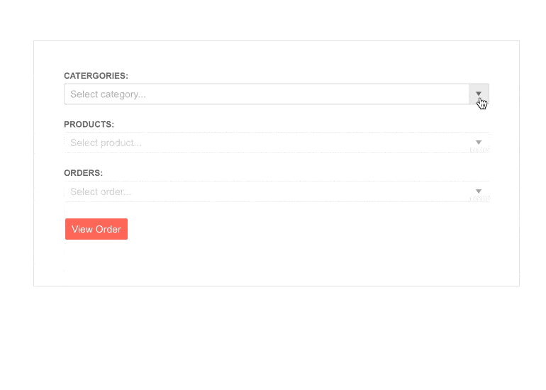
-
Floating Label
Enable a smoother and more efficient user experience with the UI for ASP.NET MVC ComboBox floating label option. You can save form space by adding a label that floats above the input, ensuring end-users don’t lose context.
-
Adaptive Mode
Set the AdaptiveMode parameter to AdaptiveMode.Auto to enable a mobile-friendly rendering of the ComboBox suggestion list popup. This mode triggers the picker component to automatically adapt to the current size of the screen and changes its rendering accordingly.
See the Telerik UI for ASP.NET MVC ComboBox Adaptive Rendering Demo
-
ComboBox Virtualization
The ComboBox, like many other ASP.NET MVC components, supports virtualization. This can be very useful when handling large datasets as the component renders a fixed number of items and, if scrolled later on, it takes the rest of the items and displays them.
Check out the Telerik UI for ASP.NET MVC ComboBox Virtualization demo -
Events
The ComboBox component fires various OnClick and OnSelect events. Some of them include Open, Close, Select, Filtering, Change and more.

-
RTL Support
The ComboBox component, like many others from the Telerik UI for ASP.NET MVC suite, supports RTL configuration. The RTL functionality is supported in my most of our components to respond to users who communicate through a right-to-left language such as Arabic or Hebrew.
-
Accessibility
Telerik UI for ASP.NET MVC ComboBox is compliant with Section 508 and WCAG 2.1 guidelines, perfect for scenarios where accessibility is a concern.
-
Keyboard Navigation
With the Telerik UI for ASP.NET MVC ComboBox, you can use the up and down arrows to highlight the previous or next item in the list. For a full list of controls and user actions, visit the demo page.
-
ComboBox Theming
You can style the ASP.NET MVC ComboBox control with one of the built-in themes such as Default (our own styling), Material (based on the Material Design guidelines), Bootstrap (which looks like the Bootstrap styling to integrate better) and Fluent (based on Microsoft Fluent UI). If you prefer, you can create new themes by using the Progress SASS ThemeBuilder application.
